Access Pensions · Disrupt DNA · 2022
Launching a new pension brand after a merger
The integrated campaign that introduced Access Pensions, formed from the merger of Sigma Pensions and First Guarantee Pensions. New customer sign-ups rose by 35%.
- My role
- Art Director & Graphic Designer
- Agency
- Disrupt DNA
- Format
- Integrated campaign
- 35% rise in new customer sign-ups
The brief
In December 2022, Sigma Pensions and First Guarantee Pensions came together as Access Pensions, making it one of Nigeria's largest pension fund administrators. The new brand set out to give every generation the knowledge, advice and tools to create their future.
The campaign had two jobs. Outside, it had to introduce a name nobody yet knew and convince existing and new customers that they would get more from their pensions. Inside, it had to bring staff from the merging businesses behind one story.
My role
I was the art director and graphic designer on the campaign, and I was heavily involved in the strategy, research and creative direction behind it.
The research and strategy, including the customer-first view and the brand language, set the direction for three big ideas. I then art directed the creative across print, outdoor, digital and film, working with illustrator Tobi Sanni on the illustrated work and storyboards.
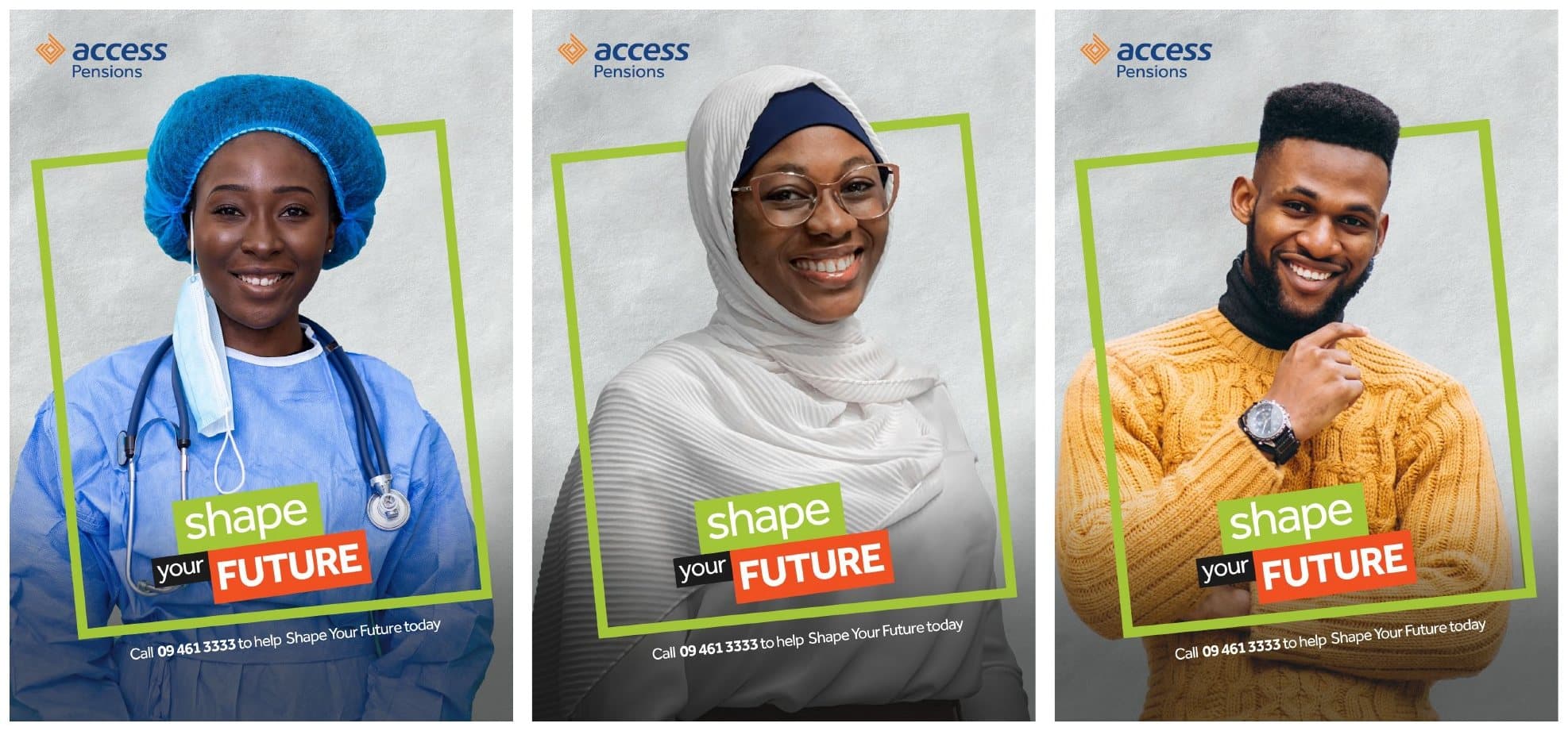
I was also a photographer on the campaign. The portraits combine my own photography with some stock images.
Starting with the customer
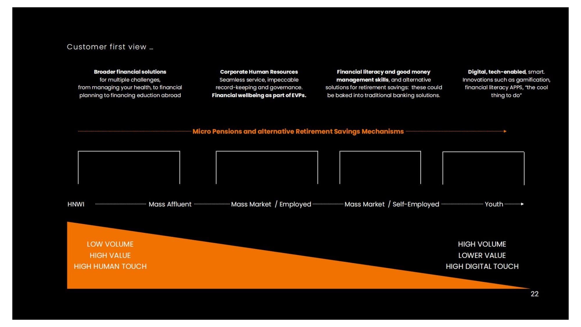
Before any campaign, we mapped who a merged pension fund administrator actually serves. The customer-first view runs from high-net-worth individuals through the mass affluent and the employed and self-employed mass market to young people starting out.
At one end the relationship is low volume, high value and high human touch; at the other it is high volume, lower value and mostly digital. Micro-pensions and alternative retirement savings run across the whole range. That spread is why the work had to speak to a senior executive and a market trader with equal conviction.
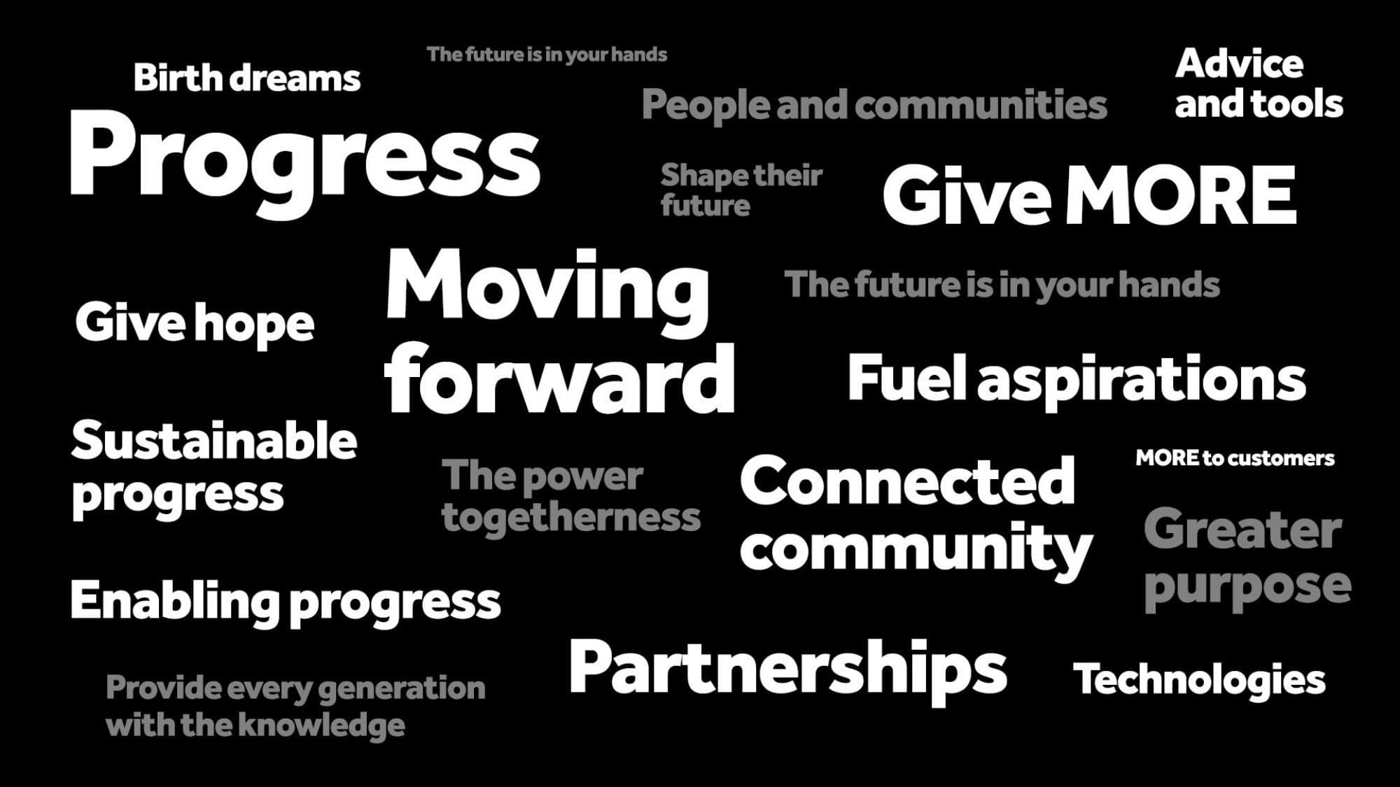
From the map came a brand language built on progress, hope, togetherness and giving more: words the campaigns could draw on whatever the audience.
Big idea: Future Shapers
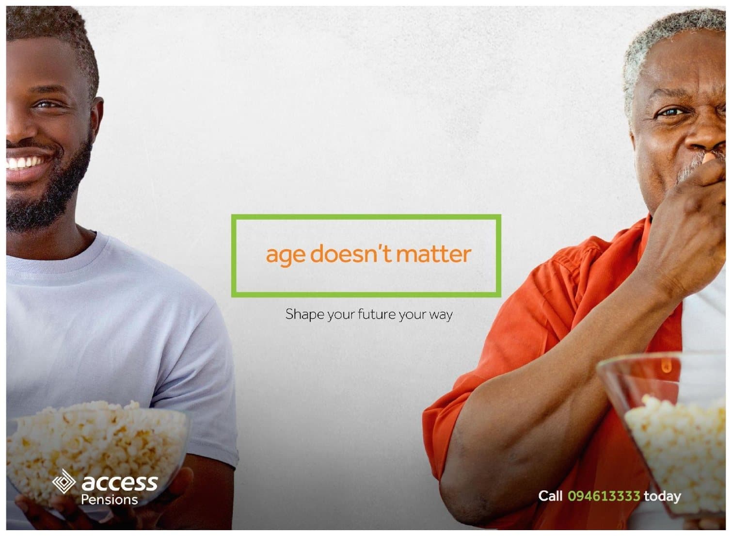
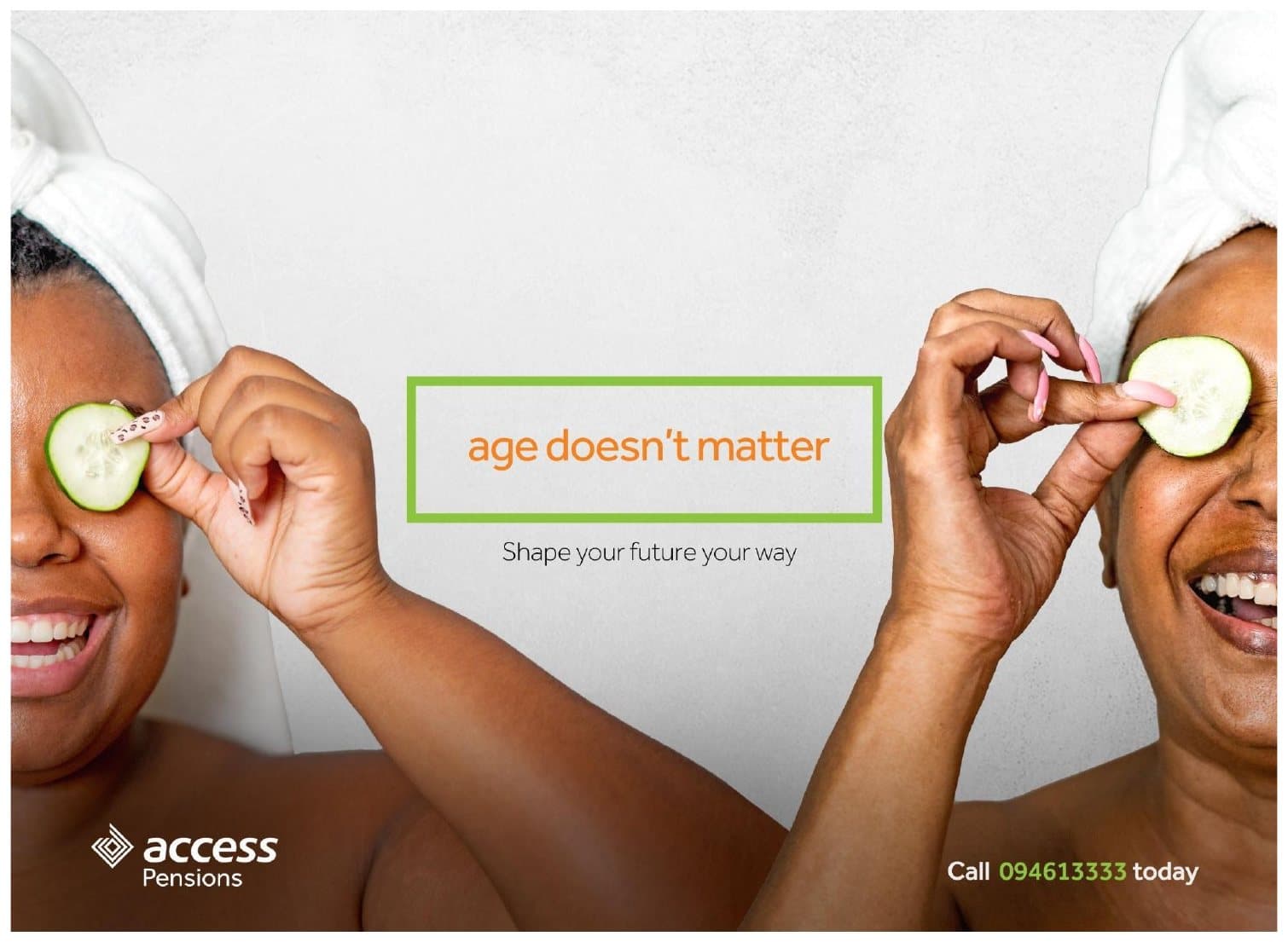
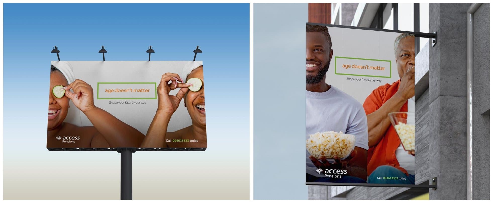
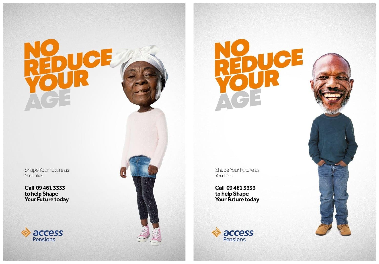
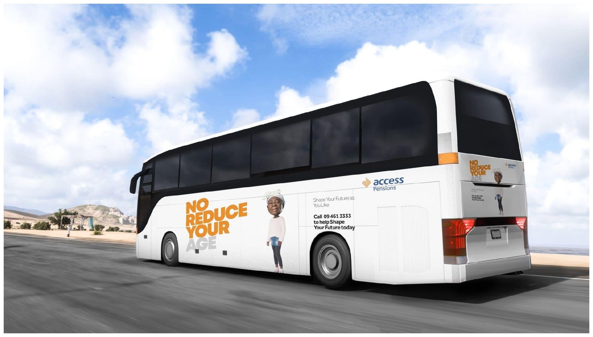
The first idea put the customer in charge: whatever your age or work, your future is yours to shape. It became the campaign that ran, through three of its four lines: Age doesn't matter, No reduce your age and Shape your future.
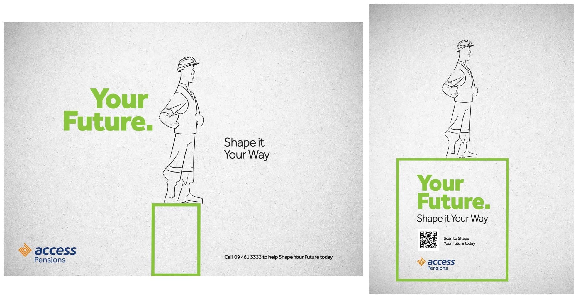
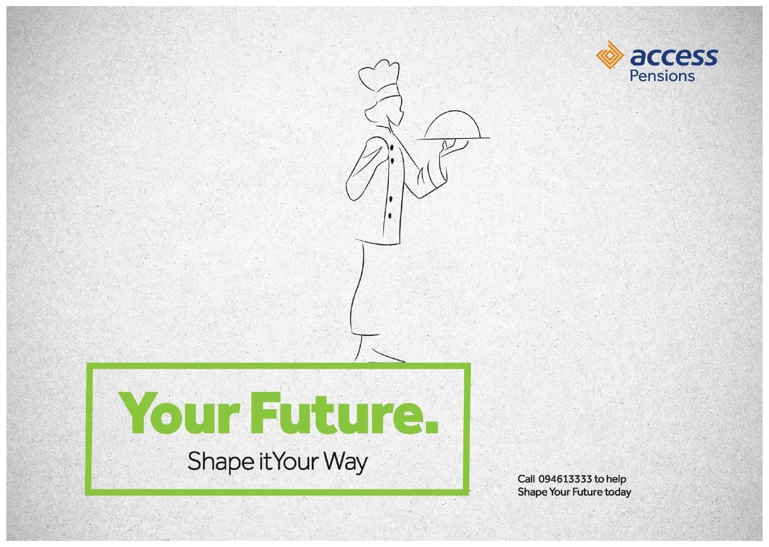
Age doesn't matter used everyday humour, people relaxing with popcorn or a face mask, to say it is never too early or too late to plan. No reduce your age took a Pidgin line about people understating their age and turned it into a nudge to start planning now, with a comic skit to carry it. Shape your future put real faces from across the customer map, from nurses to traders to retirees, at the centre. A fourth line, Your future. Shape it your way, used line illustrations of people raised up on a plinth; it was developed but did not run.
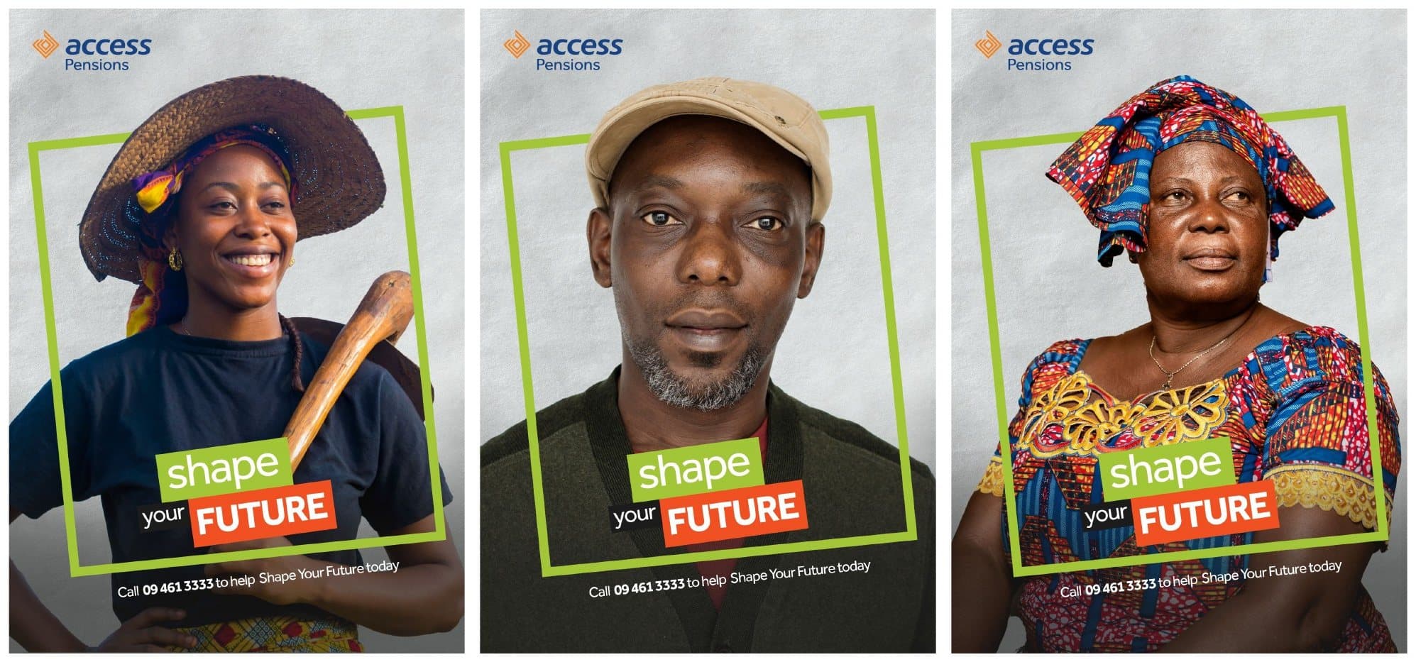
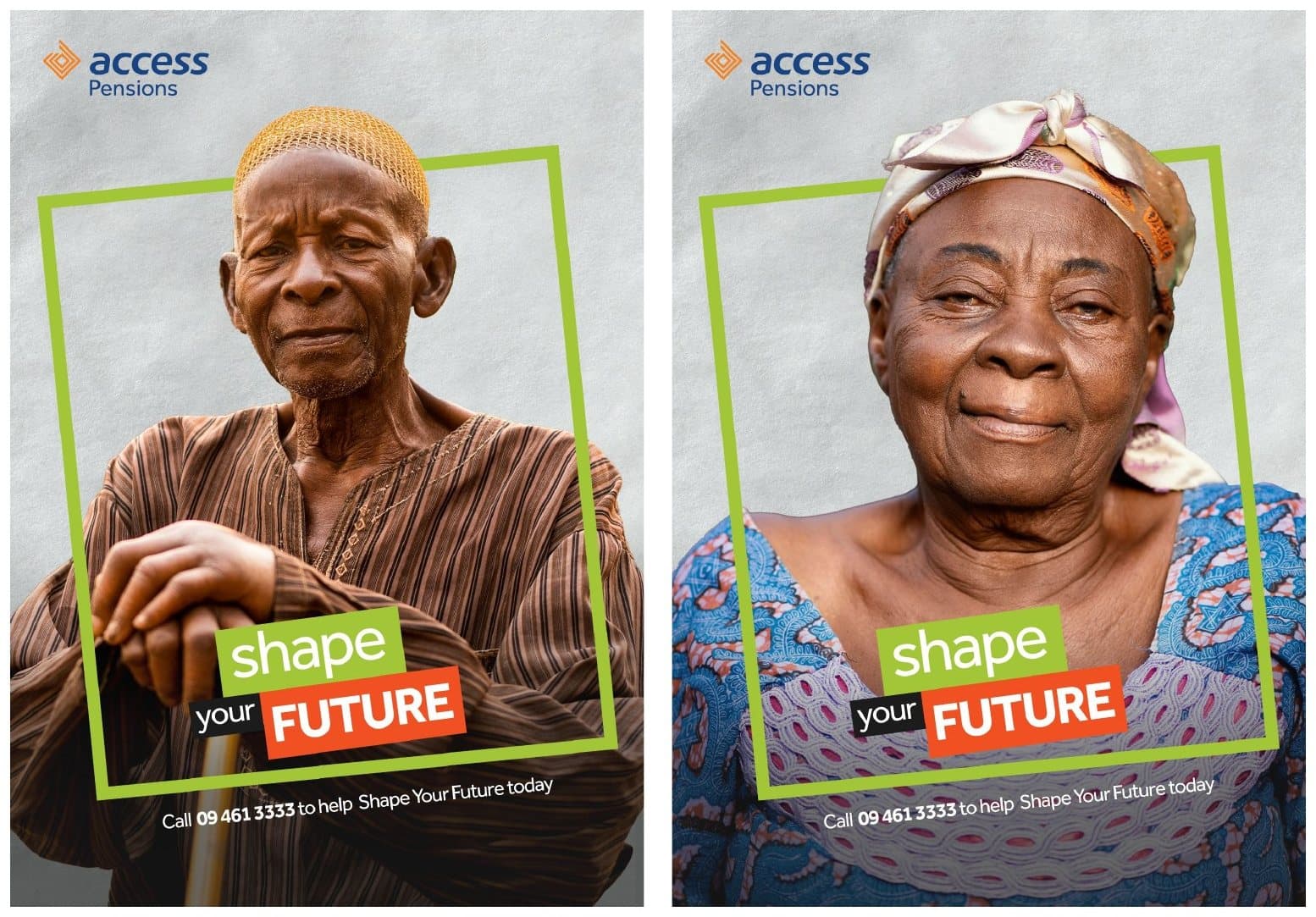
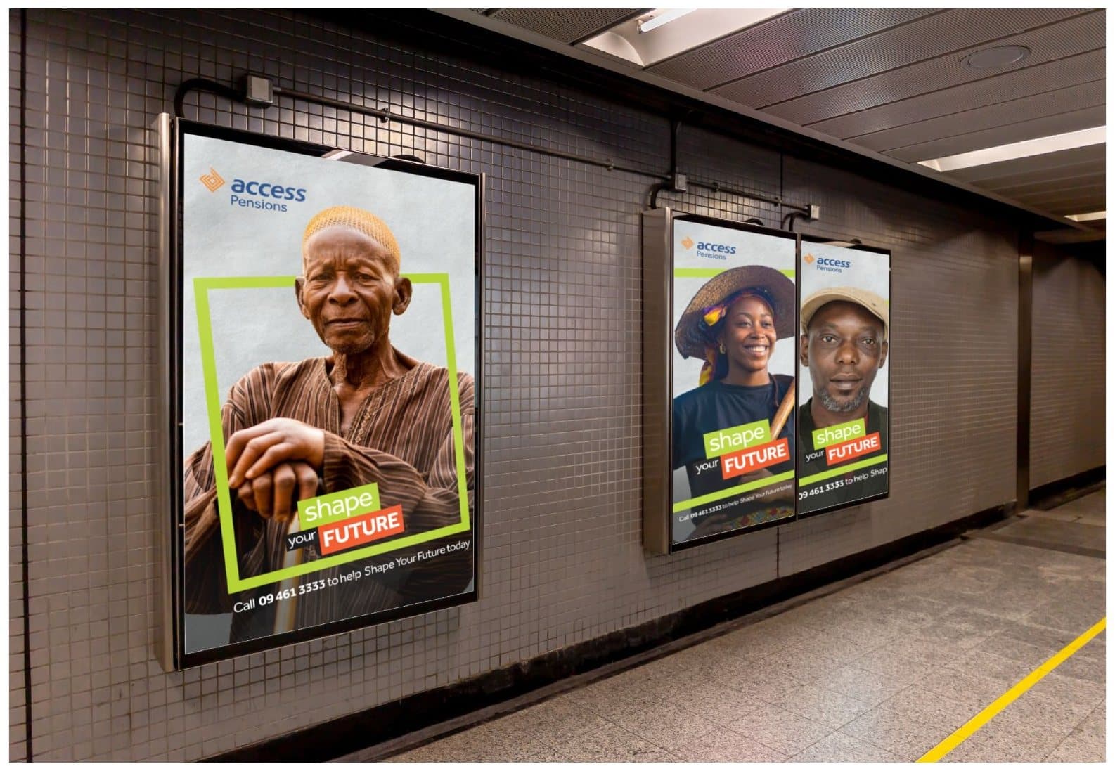
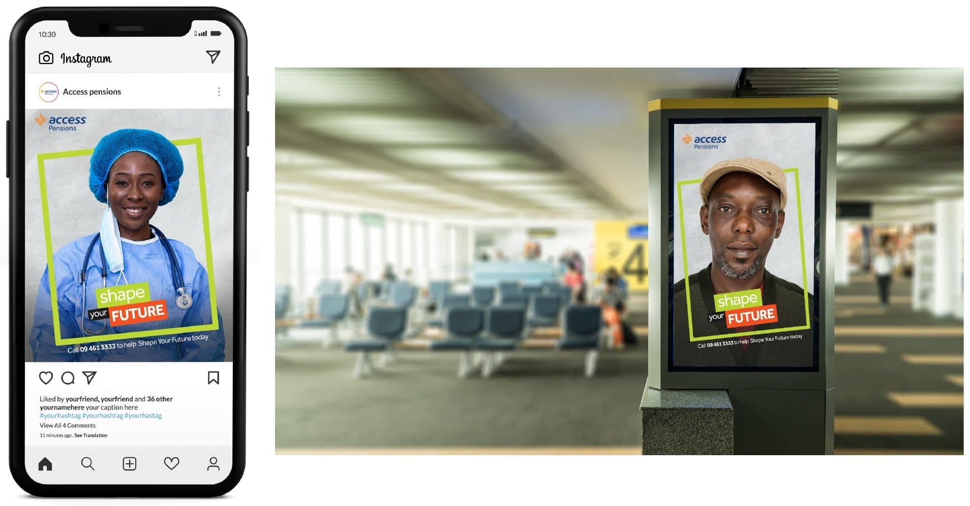

Film concepts: The Power in Your Hands
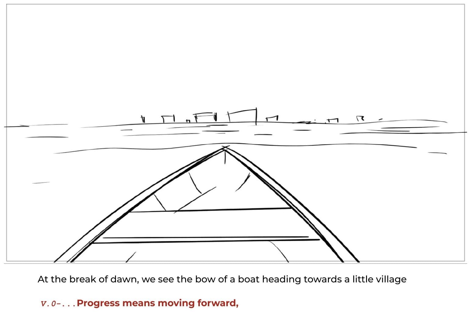
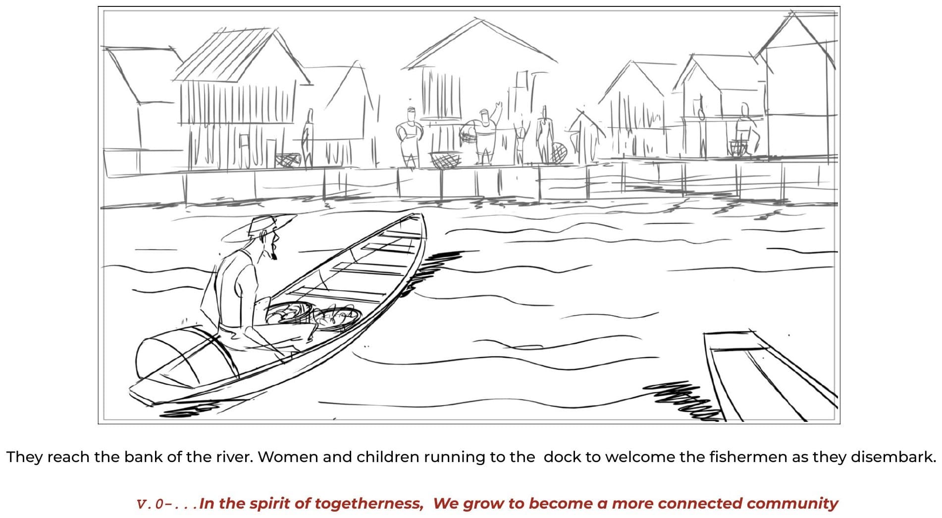
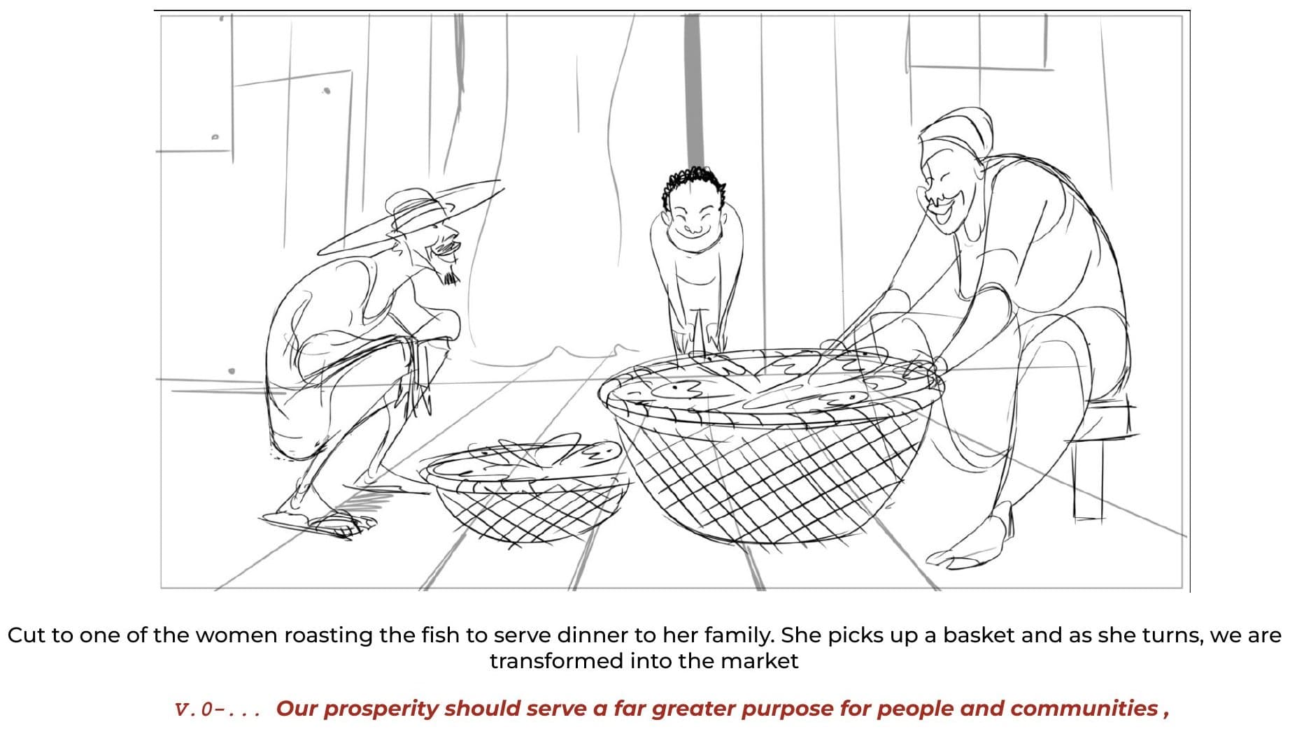
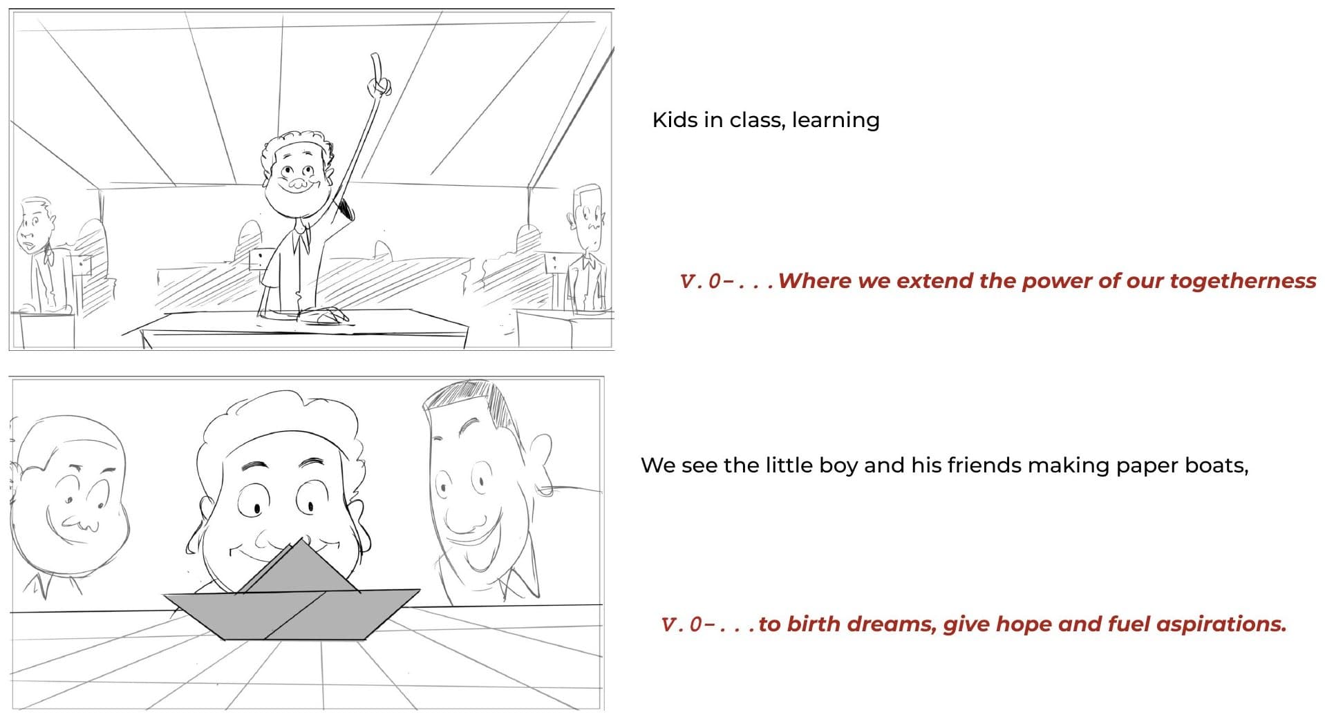
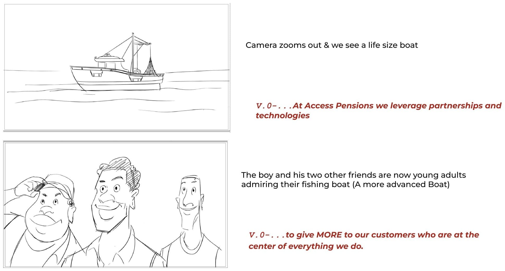
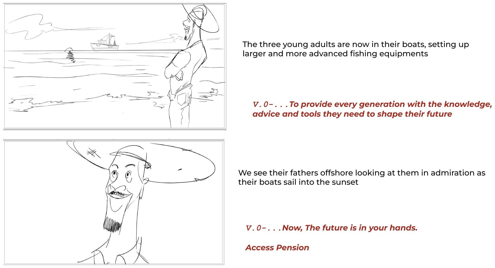
Two TV commercial concepts took Future Shapers onto screen. The first opens at dawn on a fishing village. A boy and his friends make paper boats; as they grow up, the paper boats become real ones and then a larger, better-equipped fishing boat, while the voiceover moves from birth dreams to giving more to customers. It closes on the line: now, the future is in your hands.
The second follows a father, a mother and a son who saves towards a speed boat, ending on the promise that we put the power in your hands. A radio script built around a young woman's first job carried the same idea to listeners. These were developed as concepts and storyboards, and were not produced.
Big idea: Fueling Hope
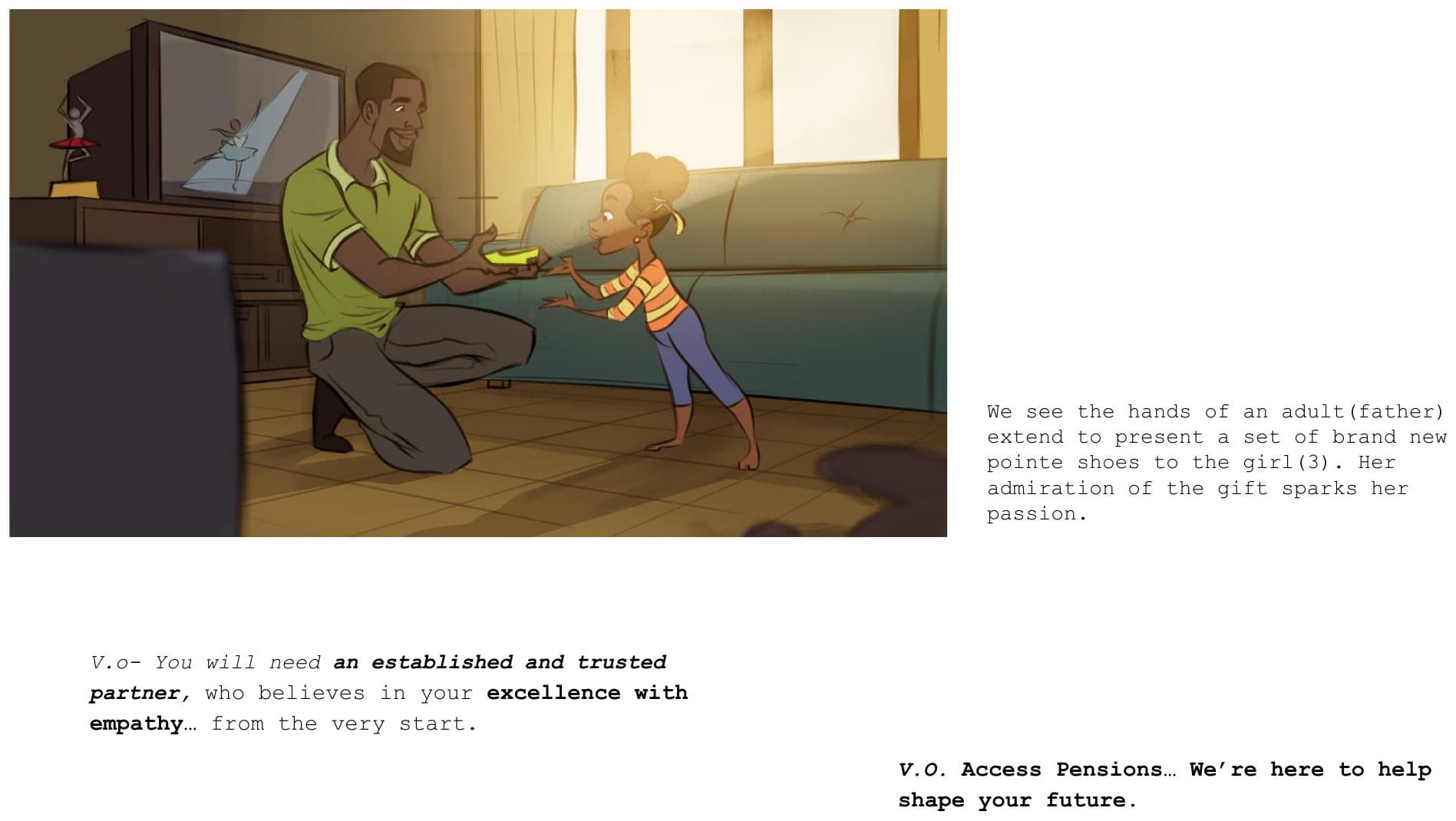
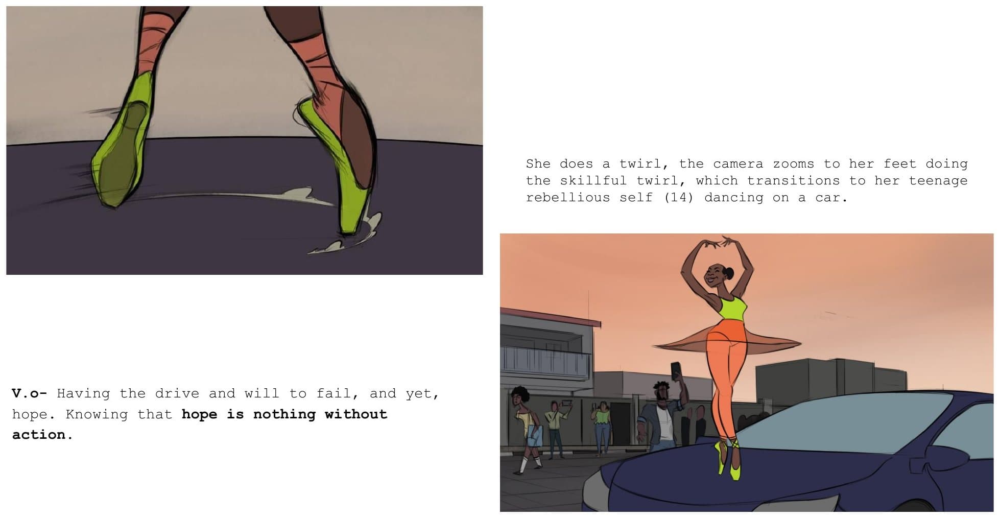
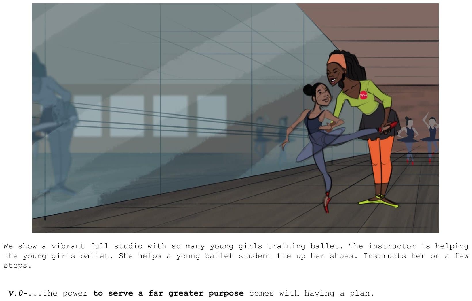
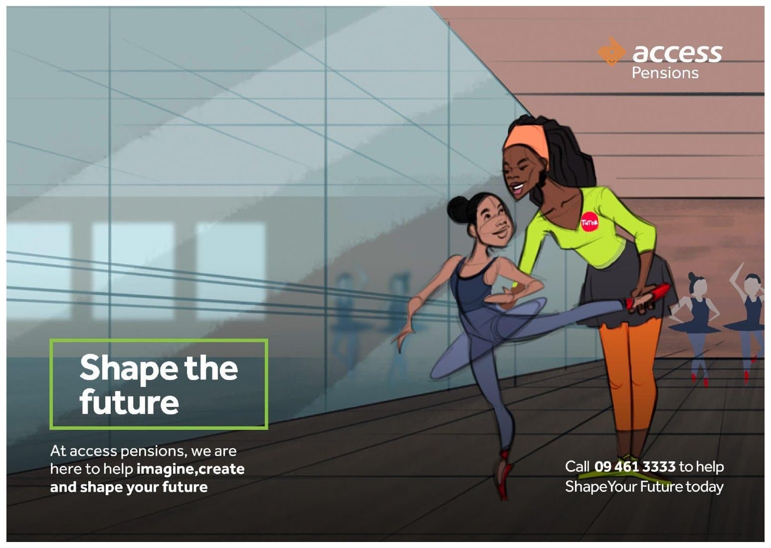
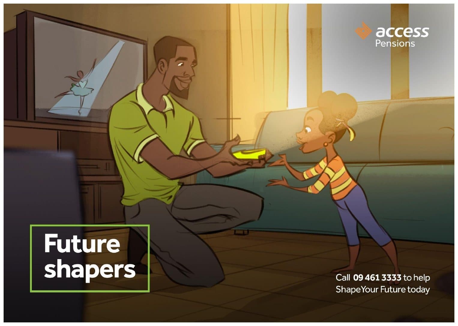
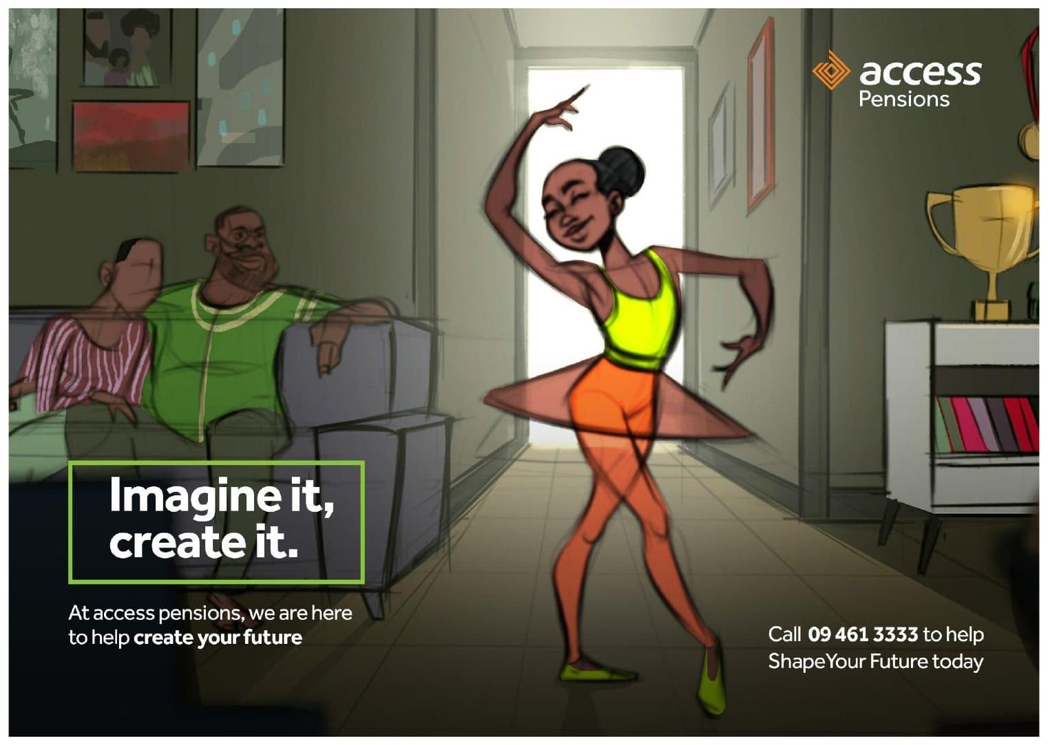
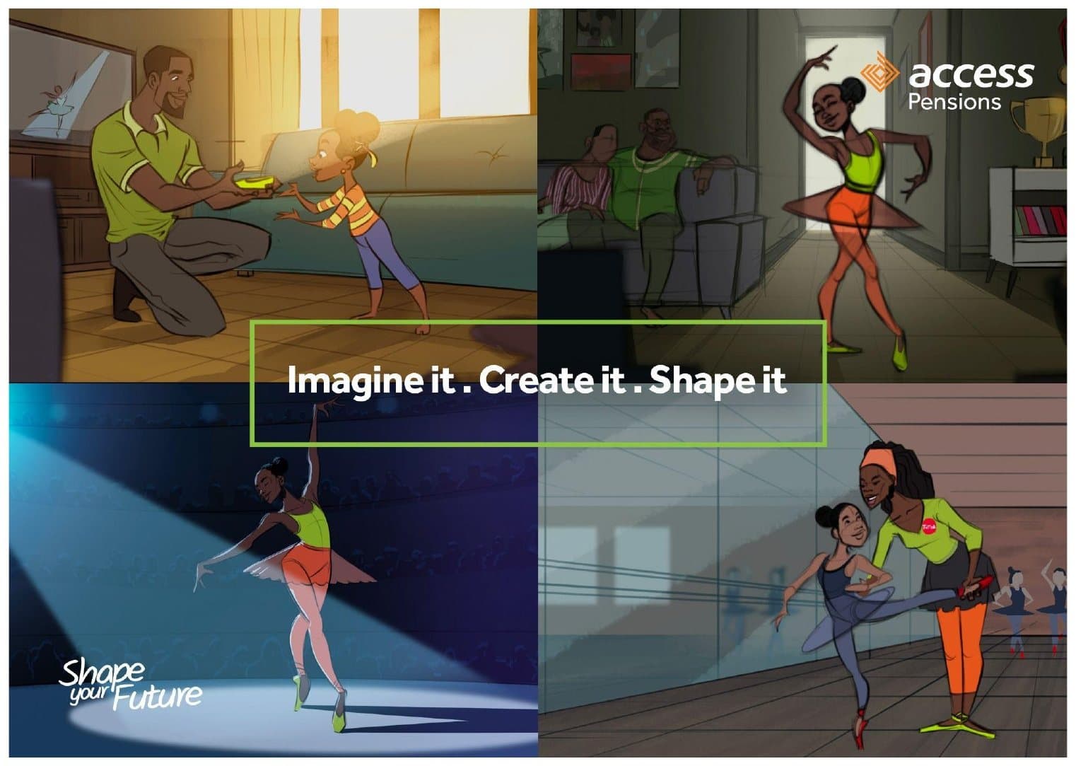
Alongside Future Shapers, we developed two further big ideas that did not run. The second idea was about the drive to imagine something better and the help needed to build it. Its centrepiece, Vantage Pointe, is an illustrated film told in reverse: a young ballerina, then the studio where she trained, then the moment her father hands her her first pair of pointe shoes. The line: if we can imagine it, we can create a world where everyone is inspired and empowered to shape the future, but not alone.
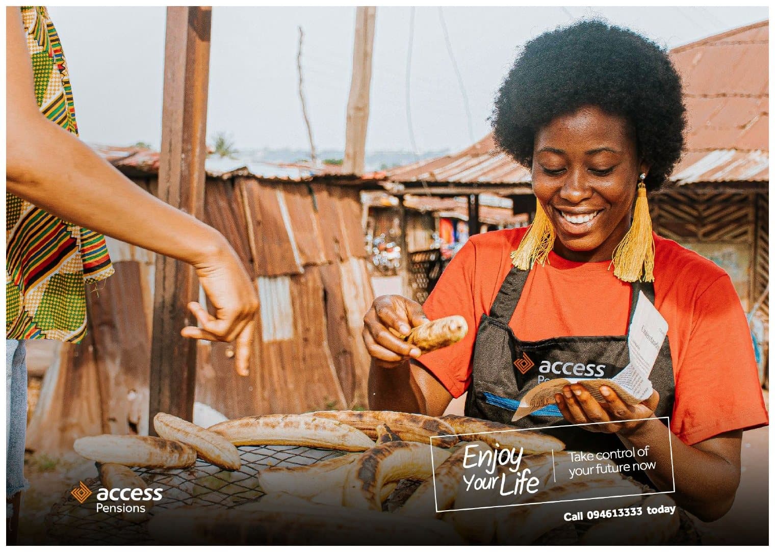
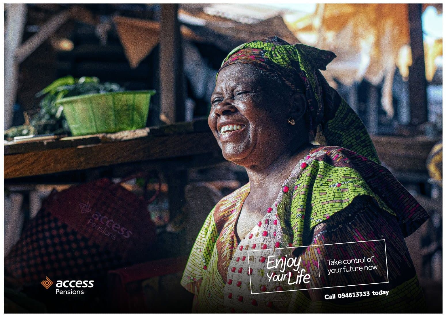
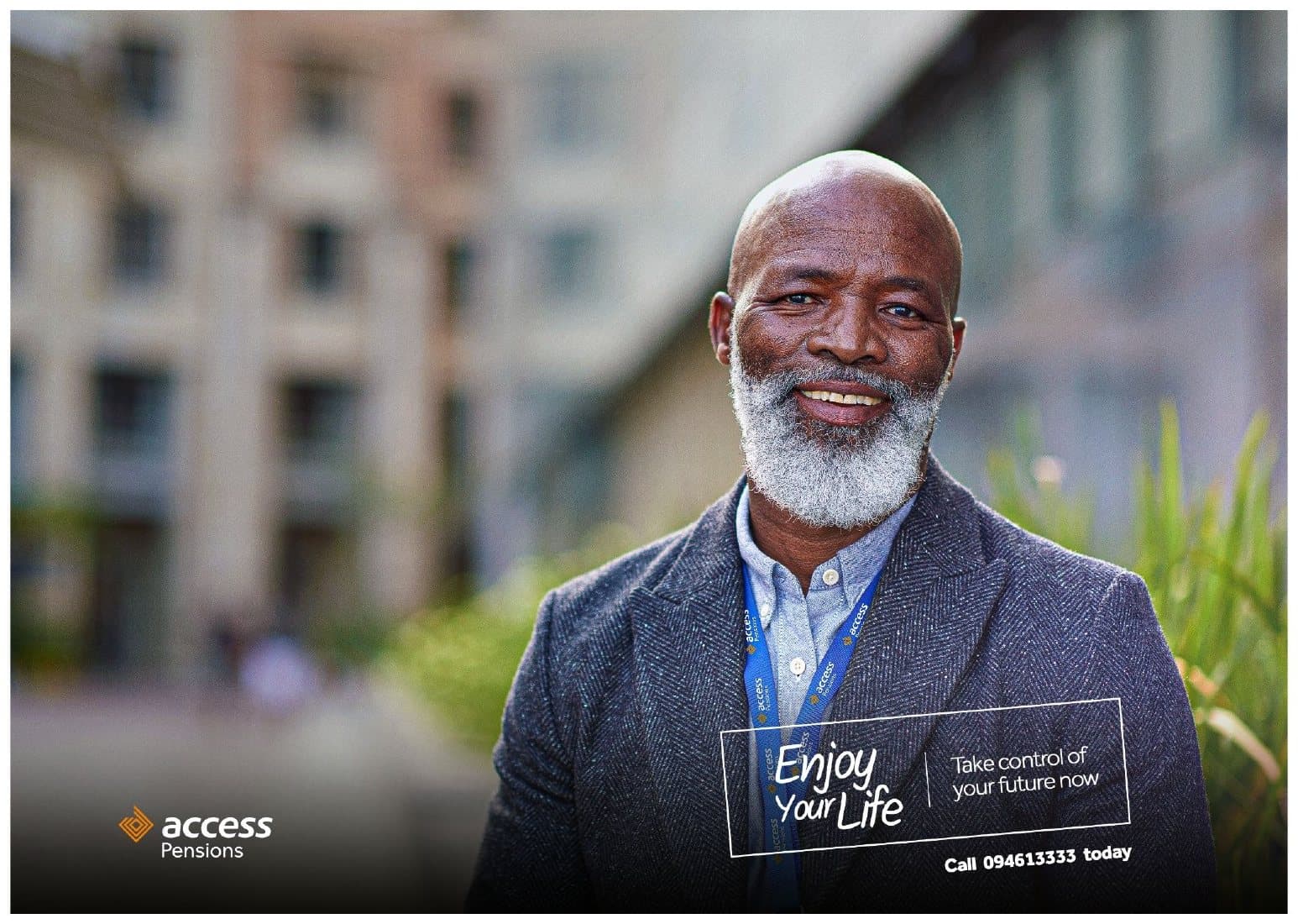
The same illustrated world became the Imagine it, Create it key visuals. Two photographic lines sat alongside: Enjoy your life, take control of your future now, for traders and retirees, and Control your future, for working professionals.


Big idea: A Bright Future
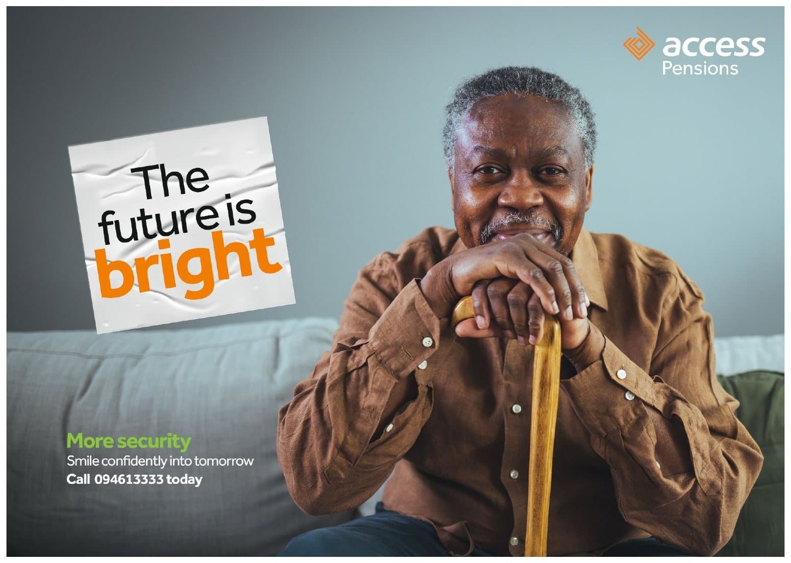
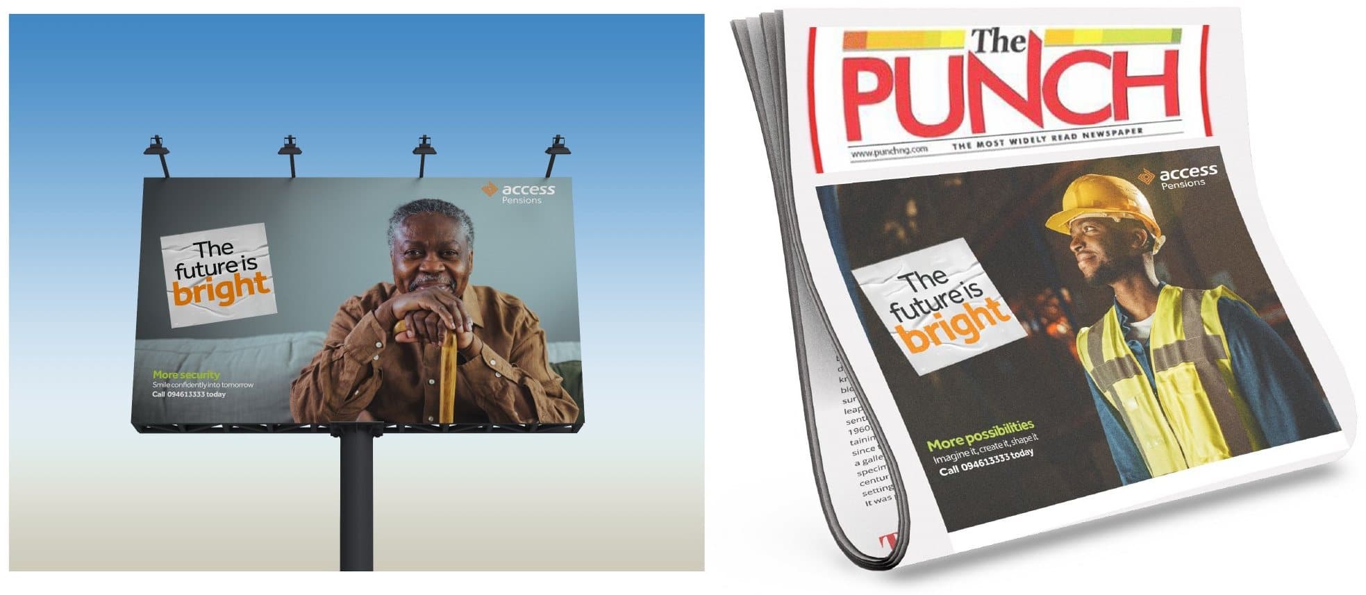
The third idea, also developed but not run, was the most direct: the future is bright. Each execution paired the line with one of three promises, More security, More possibilities and More wealth, and with a person for whom that promise matters most: a retiree, an engineer and a student.


Inside the merger: Together for More
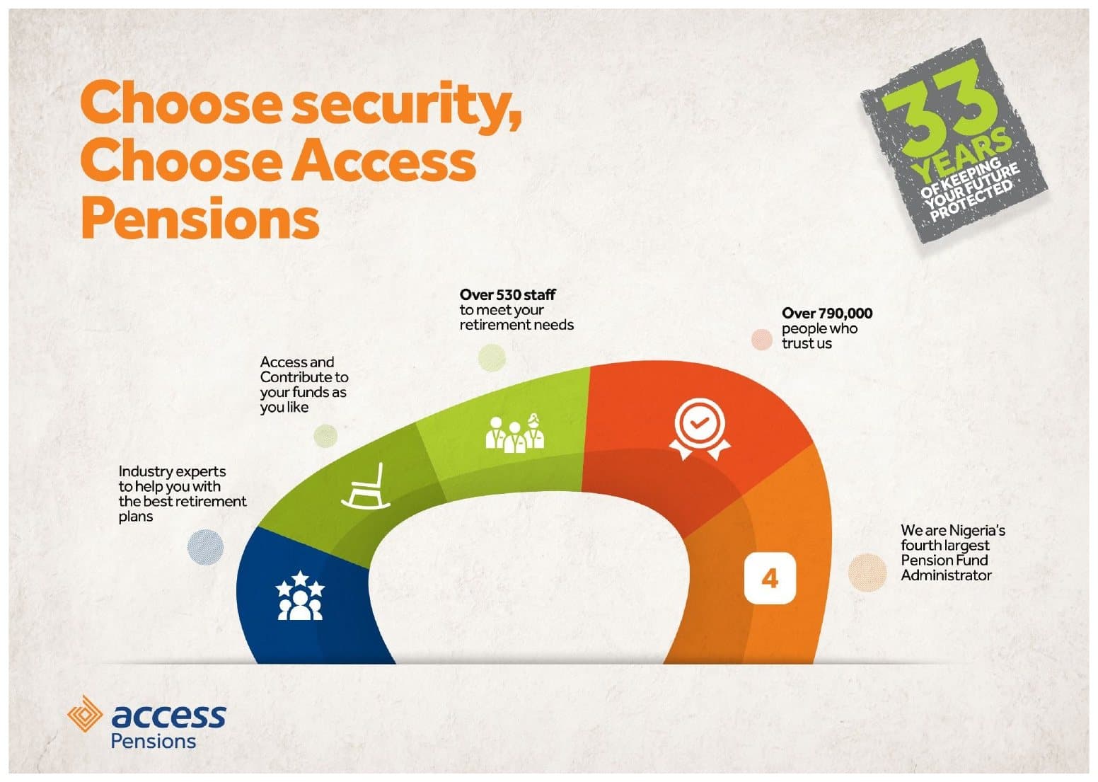
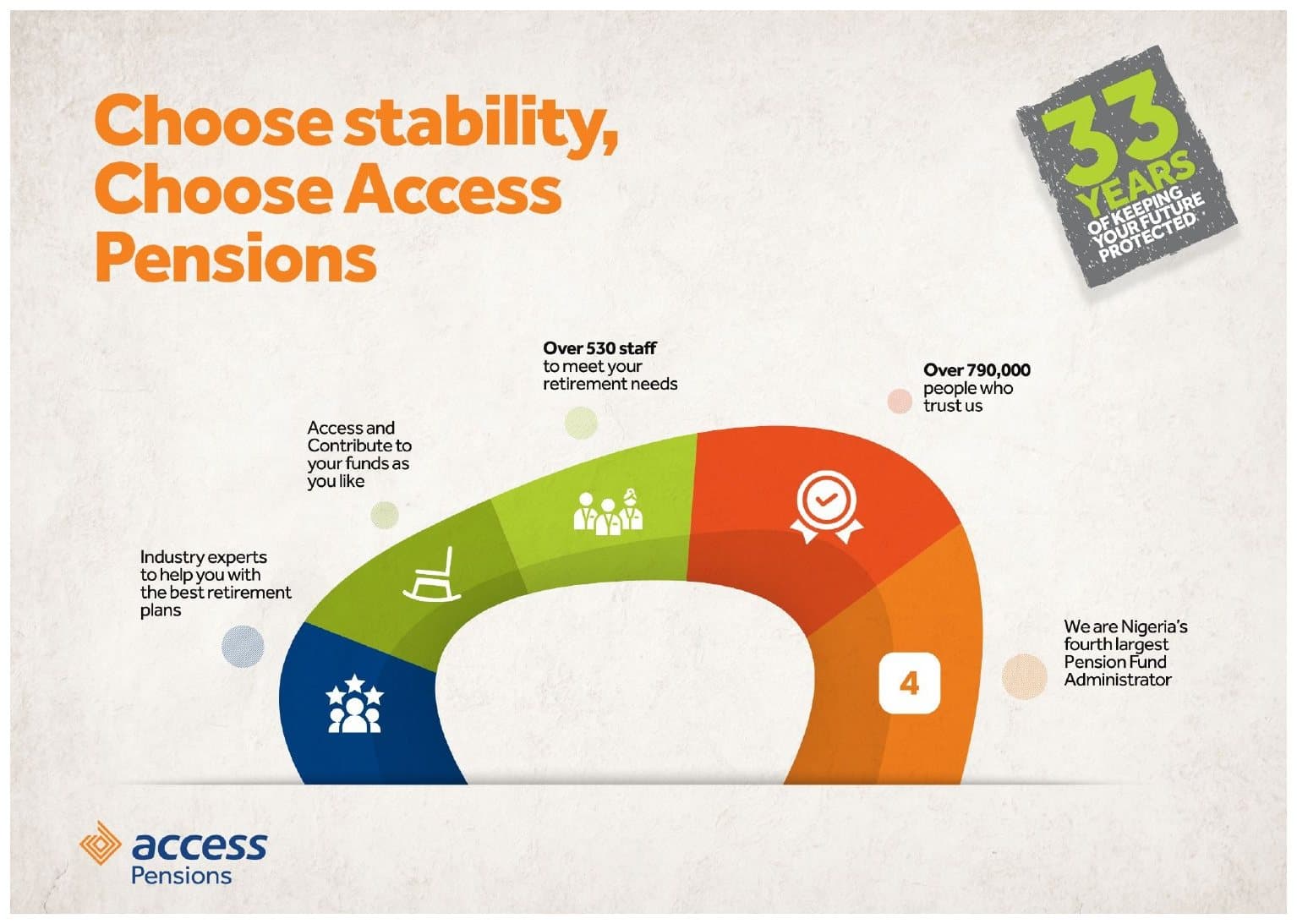
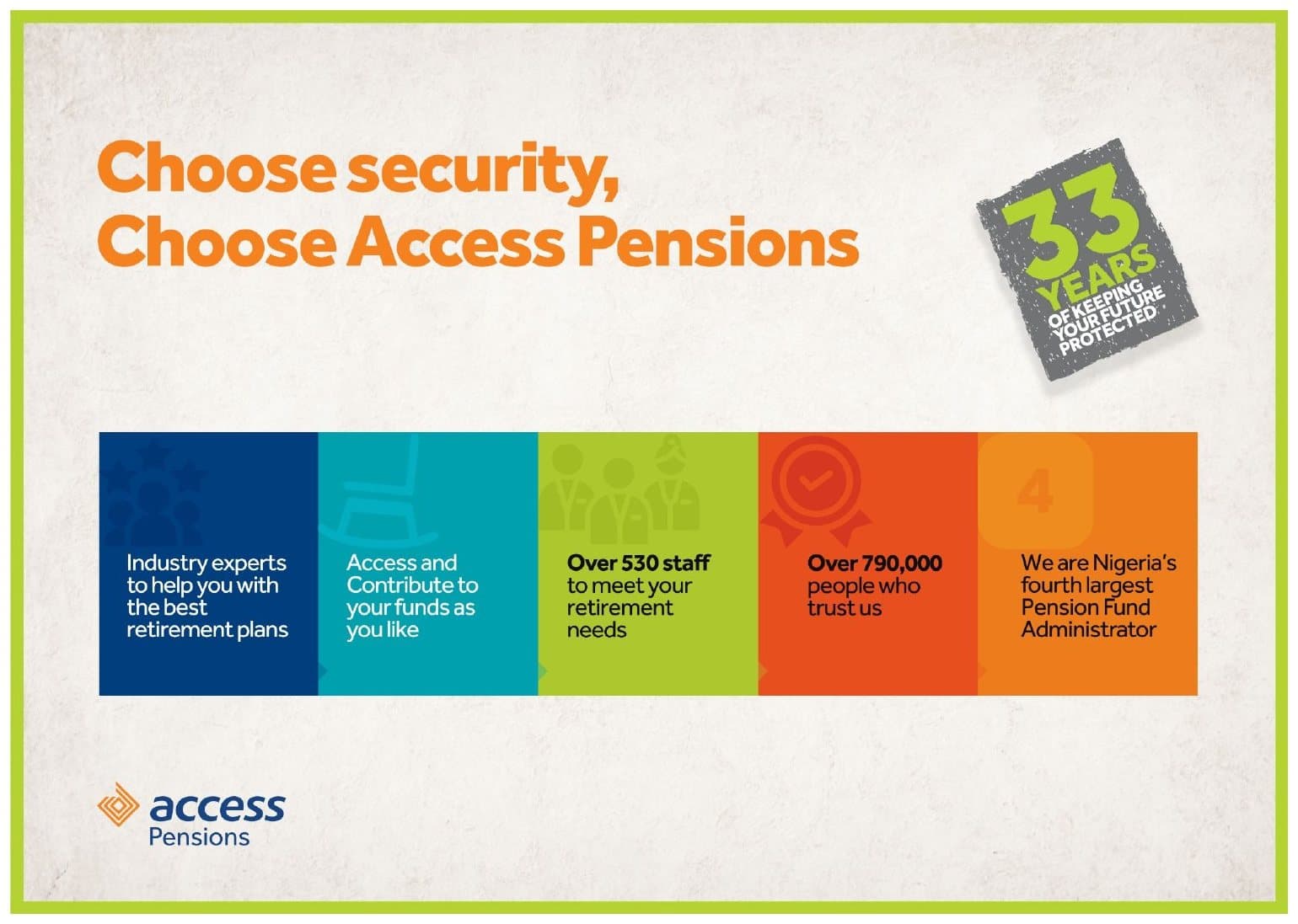
A merger is also a change for the people inside it. The internal campaign, Big Picture, gave staff from the merging businesses one story to tell: choose security, choose stability, choose Access Pensions.
The visuals turned the new company's strengths into a single arc: industry experts to help with retirement plans, more ways to access and contribute to your funds, over 530 staff, over 790,000 people who trust us, and Nigeria's fourth largest pension fund administrator, under a 33 years mark. Together for More messages carried the benefits staff could talk about: more liquidity, access to 25% pension withdrawal and an ecosystem of pension, banking and loans.
The results
The client approved the work without difficulty, and three Future Shapers lines went to market: Age doesn't matter, No reduce your age and Shape your future.
After the launch, sign-ups from new customers rose by 35%.
Credits
- Art Director & Graphic Designer
- Philip Ajibade
- Photography
- Philip Ajibade, with some stock images
- Illustration
- Tobi Sanni
- Agency
- Disrupt DNA
- Client
- Access Pensions