CWS-CARES · California · 2017–2019
Designing for RFA approvals and sibling-placement decisions
I used research synthesis, journey mapping and interactive prototyping to explore two demanding areas of child welfare work: approving resource families and finding potential placements for children. My focus was on making the information, progress and actions within these workflows easier to understand.
- Role
- Interaction Designer & UX Strategist
- Client
- Child Welfare Digital Services (CWDS)
- My involvement
- 2017–2019
My role in a large, collaborative programme
I drafted the Child’s Experience Map, analysed layered RFA-worker journeys, prepared research questions and synthesised insights from group sessions. I also created wireframes and interactive prototypes, including the family-finding concept demonstrated in this case study.
Much of the interface design was co-created. I developed some screens individually and worked with colleagues on others. The service maps, story maps and RFA application prototype represent team work; the family-finding interactive prototype is a specific example I created.
The challenge: one service, different ways of working
Child Welfare Digital Services (CWDS) was developing CWS-CARES to replace California’s existing Child Welfare Services / Case Management System (CWS/CMS), while continuing to operate it. The service supported professionals responsible for children’s safety, permanency and well-being.
The programme initially prioritised working software within separate service modules. Research happened inside those teams before an end-to-end discovery and framing phase had taken place. That made it difficult to understand dependencies between roles, processes and systems across the service.
Resource Family Approval (RFA), the caregiver approval process, exposed this complexity. Statewide requirements had to work alongside established county processes. Counties differed in scale, staffing and operational practices. A coherent interface had to account for those differences and for work extending beyond any single application.
A cross-functional group of strategists, designers, researchers and frontend engineers came together across modules. With subject matter experts and frontline county workers, the group developed service blueprints and journey maps to examine those connections.
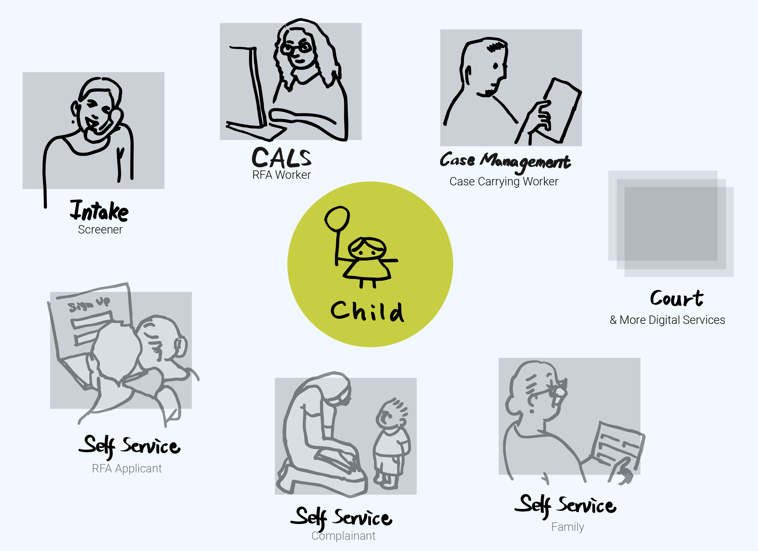
Mapping the experience behind the workflow
After interviewing subject matter experts from several counties, I drafted the Child’s Experience Map. A VA journey-map format provided a reference for organising an experience into stages and identifying moments that mattered. The team extended and refined the draft through further interviews with specialists and people with experience of foster care, then validated it through interviews and workshops.
Some stakeholders questioned why we were mapping children’s experiences when social workers would use the software. That tension mattered: the interface served professional tasks, while the wider service shaped children’s lives.
For the RFA work, the team mapped both caregiver and worker journeys. I compared individual workers’ highs and lows as layered waves, looking for recurring patterns within counties, across smaller counties and among early adopters. This made variation visible alongside the common process.
The April 2017 worker journey shown here represents three RFA workers. It combines process stages with tools, pain points and requests: missed assignment notifications, repeated data entry, difficulty finding information and workload tracking that relied on memory or personal systems.
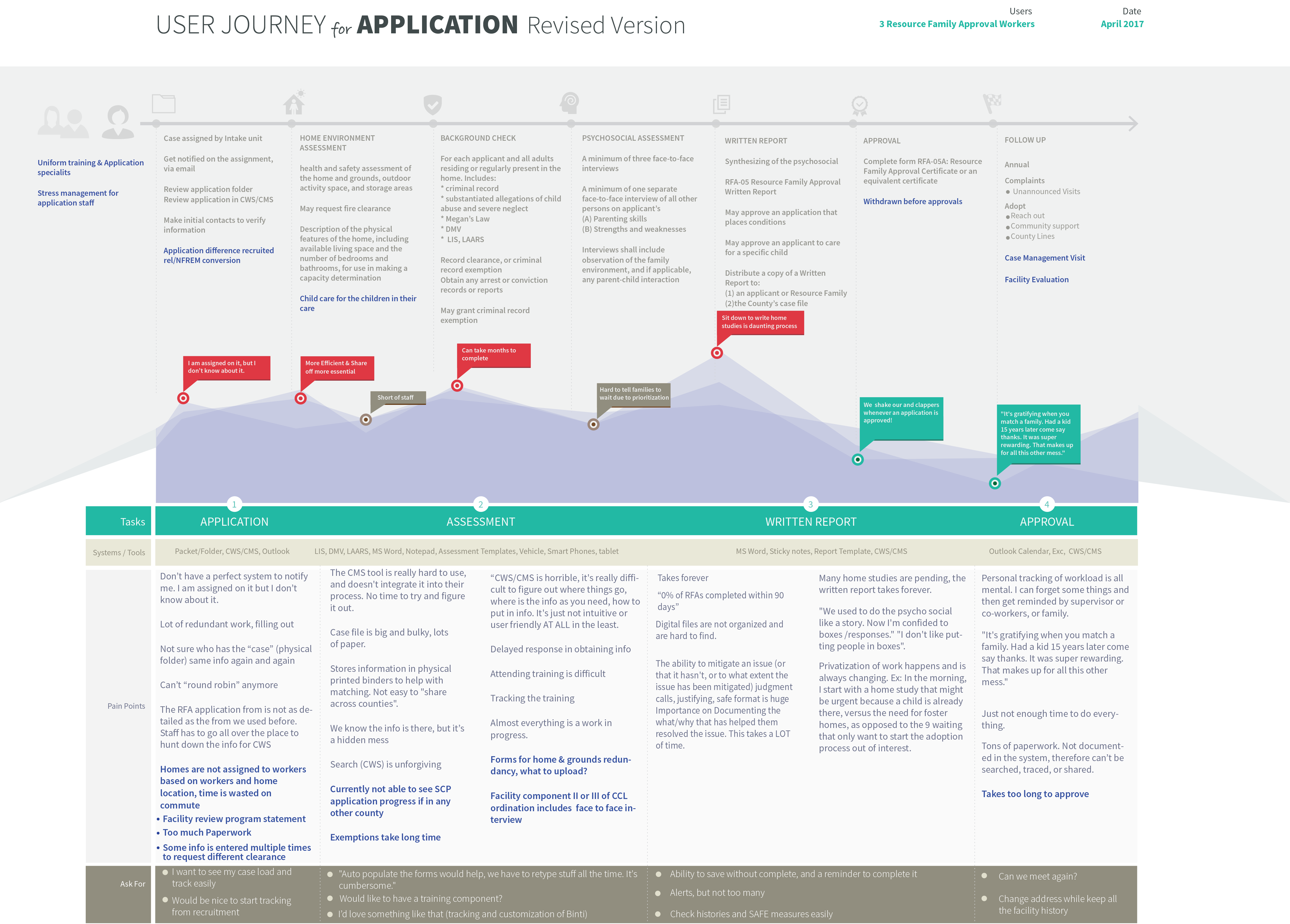
Turning research into design questions
The research made the interaction problem more specific than “modernise the system”. An April 2017 debrief from San Francisco and San Jose recorded 14 interviews and three field visits. Its findings highlighted workload management, data accuracy and repetitive work across software and paper records.
Those findings give the design work three concrete questions:
- Process visibility: how can workers see where an application stands and what remains outstanding?
- Information access: how can they find the records and documents needed for the next task?
- Workload management: how can the interface support ongoing work without requiring workers to remember every outstanding item?
I prepared questions for group sessions and synthesised the insights that emerged. Quarterly Q meetings provided a setting for workshops, testing, role plays and design discussions with county representatives.
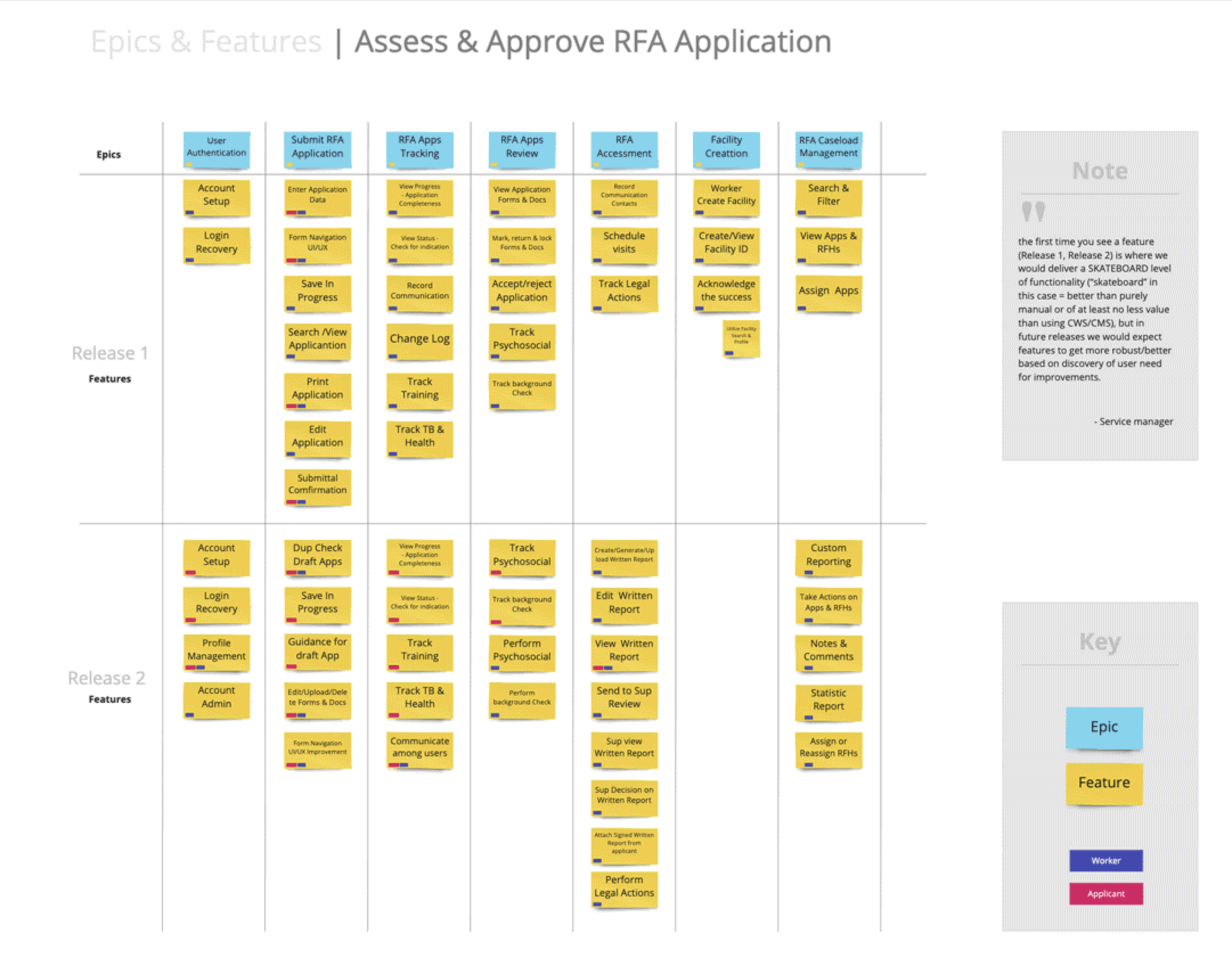
The team translated findings into problem statements, broke them into smaller issues and used story mapping to group, connect and prioritise the work. The planning board links epics—larger areas such as application tracking or assessment—to individual features and stories. Its legend distinguishes stories written from those entered into Jira, making the connection to backlog work explicit.
The roadmap separated initial capabilities from later improvements. It also retained unresolved questions, including the relationship between application status and completeness. These are different kinds of information: an overall status does not, on its own, explain which tasks or documents are outstanding.
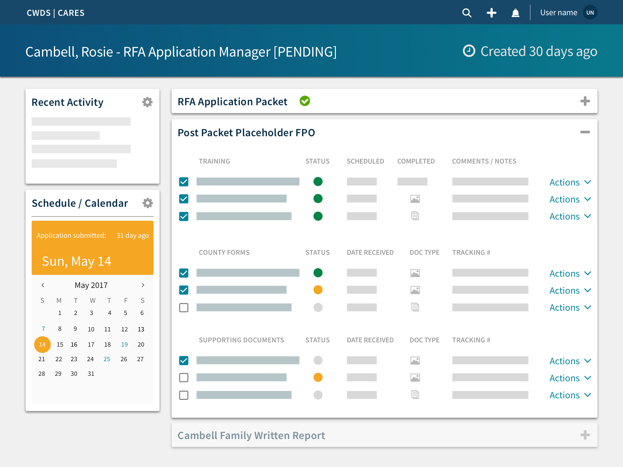
Prototyping the RFA flow across roles
I created wireframes and prototypes with the aim of clarifying process, status and next steps. The team started with low-fidelity sketches, checking concepts with subject matter experts before taking iterated designs to county social workers for feedback and test runs.
During intensive collaborative sessions, we built a high-fidelity RFA prototype spanning login, dashboards and caseloads, draft-application creation, assessment and approval. Mapping connected screens across roles allowed the team to examine a complete flow rather than review screens individually.
The application-management screen shows how this approach took shape in the interface. It groups the application packet, training, county forms, supporting documents and written report into sections. Rows expose status, relevant dates, document information and actions; recent activity and scheduling sit alongside the application work.
That information hierarchy makes the design intent concrete: give workers an overview of the application while keeping the details of individual tasks accessible. This was a collaborative prototype for examination and feedback, rather than evidence of a measured improvement in live casework.

Family finding: making a placement search tangible
A placement account shared by the team involved six siblings who needed care. After exploring family and family-friend options, their social worker faced uncertainty about finding a foster home for all six. The children were asked which siblings they wanted to stay with if separation became necessary.
I received this account through the team. It provided a concrete context for exploring how placement workers might consider sibling relationships alongside available placement options.
I created the interactive Lifelong Connections Finding Tool prototype to help the team envision that workflow. The design brought several parts of the task into a single search experience:
- Child and sibling context: workers could select the child and include siblings in the search context.
- Placement criteria: controls exposed proximity to home and school, language, available beds and clearance-related criteria.
- Comparable results: cards brought together relationship, availability and contact information for potential connections and placement options.
- Follow-up actions: multi-select and a batch-action menu explored recording relative-notification and connection statuses across selected results.
These interactions made the concept specific enough to discuss: which children are involved, what criteria are visible, what information appears in a result, and how a worker could record follow-up activity. The prototype helped the team explore these questions; it did not establish that a suitable placement had been found.
The accompanying recording shows demonstration profiles rather than the six-sibling case. It captures the interaction concept, including selection, filtering controls and batch actions.
What I contributed
My work helped turn a complex service into artifacts the team could inspect and discuss: an initial child-experience map, analysis of worker journeys, synthesised session insights, wireframes and interactive prototypes.
The family-finding prototype is the clearest individual example. It translated a difficult placement task into a tangible interface, bringing sibling context, search criteria, result information and follow-up actions together for team exploration.
The lesson I took forward was the importance of designing both the screen and its place in the workflow. A status indicator or document row only becomes useful when it reflects the information and decisions a worker needs at that point in the service.
This case study covers my research and design contribution during 2017–2019. The outcomes described concern research synthesis, shared planning and prototype exploration; live service outcomes and measured usability changes are outside the evidence available here.