GoldWise · Fintech · Mobile product design
Making precious metals investing easier to navigate
I led the UX for a mobile platform designed to help people explore, buy and invest in precious metals. My focus was on simplifying unfamiliar trading journeys for people with different levels of investment experience.
- Role
- UX lead · Research, design & validation
- Product
- Precious metals investment app
- Duration
- Four months
The challenge
Precious metals trading asks people to make decisions using unfamiliar terms, market indicators and account requirements. For someone new to investing, understanding what to buy can be as demanding as completing the purchase itself.
GoldWise set out to bring buying, selling and investing in digital and physical metals into one mobile experience. The design challenge was to support different levels of knowledge while making the next action clear.
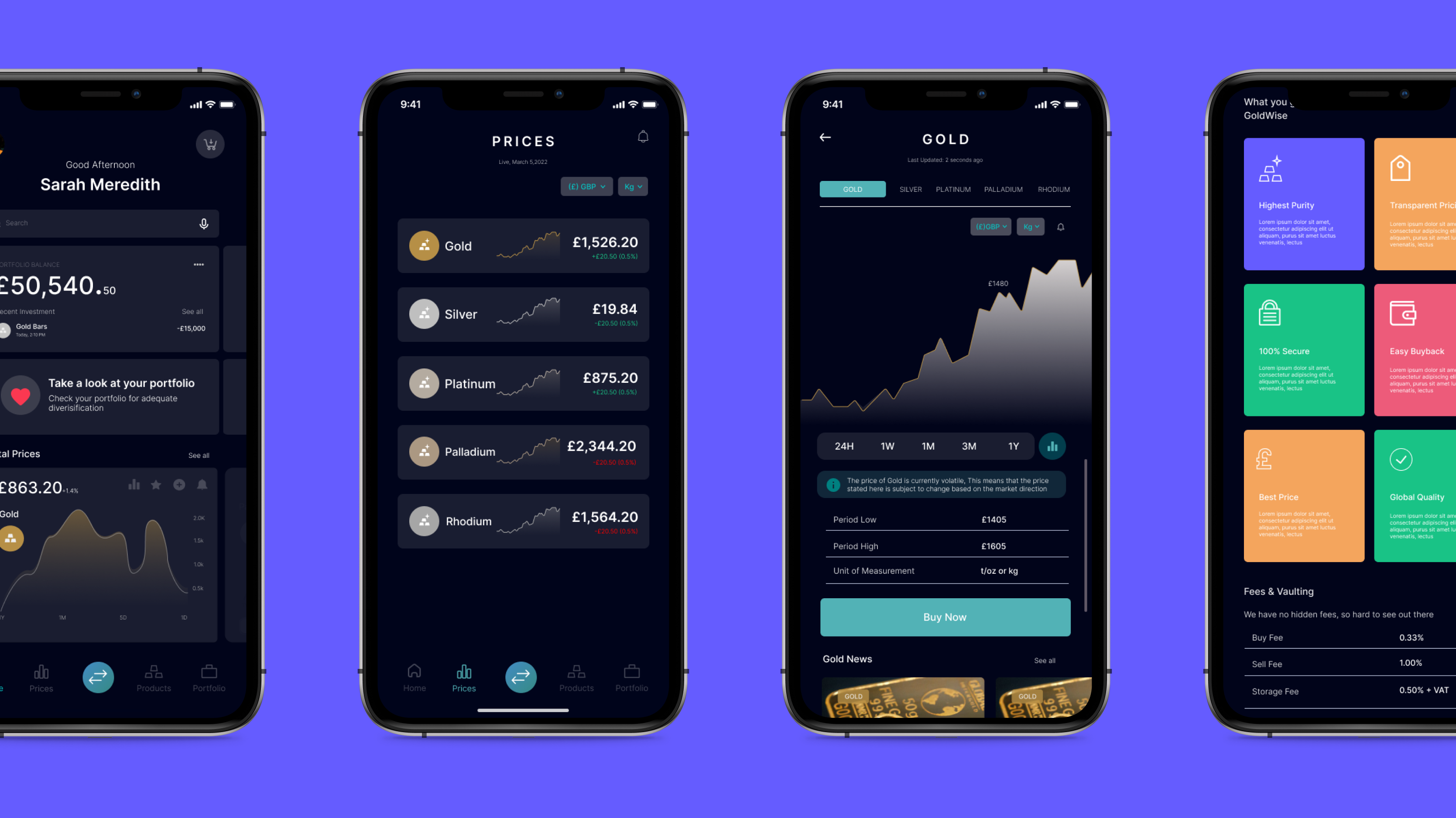
Learning from traders
I led research, design thinking, interface production and validation. I combined secondary research with a screener survey and remote interviews with experienced traders and a newer investor. The interviews explored how people chose a platform, followed market updates and managed trading accounts.
I synthesised the findings through affinity and empathy mapping, personas, competitor analysis and buying journeys. The recurring concerns were the effort of researching an investment, managing multiple tools and finding a platform people felt confident using.
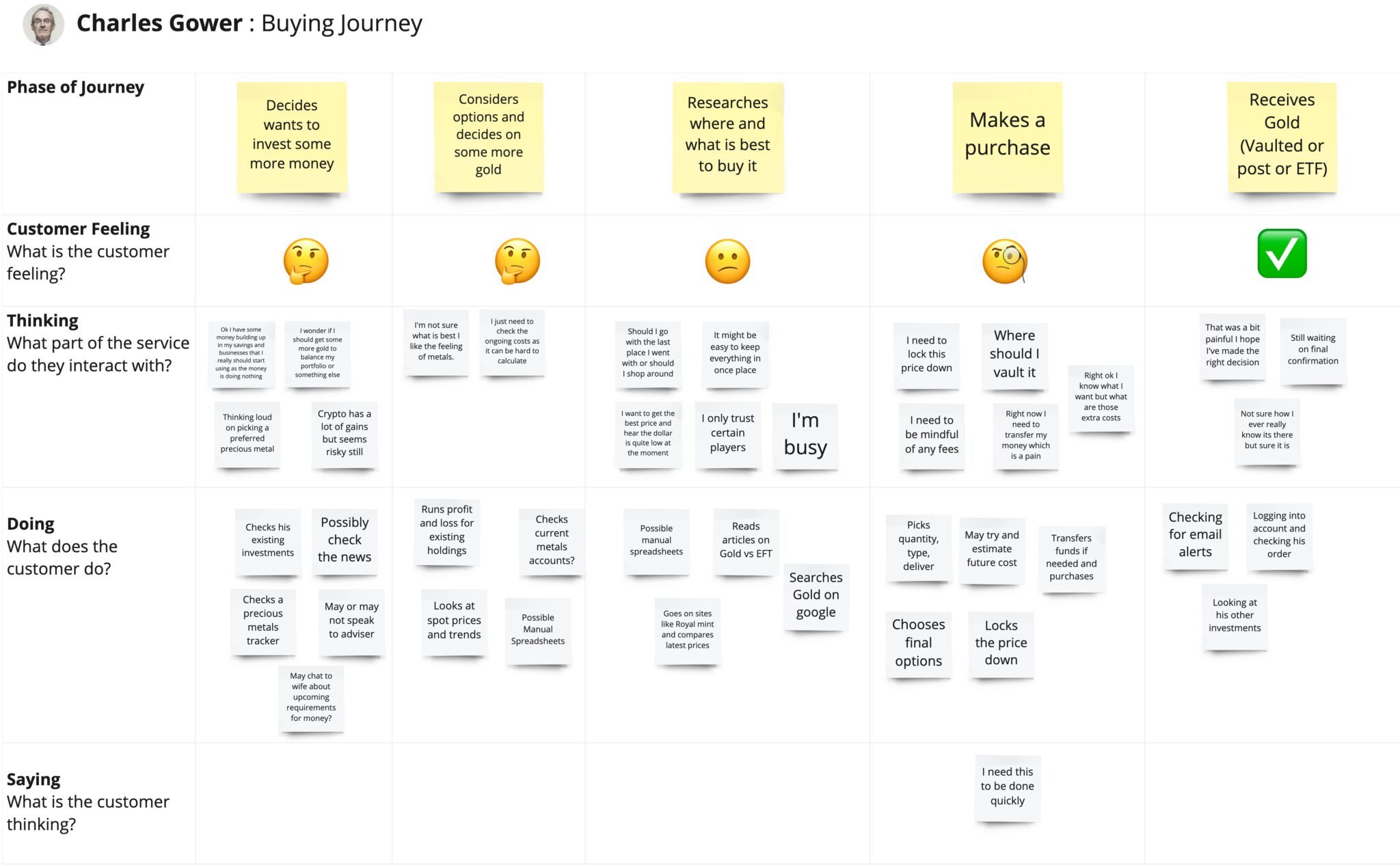
Choosing a focused first release
The research opened up several possible directions: investment guidance, account management, forecasting tools and physical delivery. I focused the MVP on helping people find an investment and buy, sell or invest in their chosen metal with less friction.
The guiding question became: how might we enable users to find the right investment and purchase precious metals of their choice with ease? This gave the team a smaller, testable starting point rather than trying to address every trading need at once.
Designing the entry into trading
I explored a GoldWise starter kit: a personalised plan and resource guide informed by experience, preferences, available time and budget. The intention was to give newcomers a clearer starting point and support people with different levels of trading knowledge.
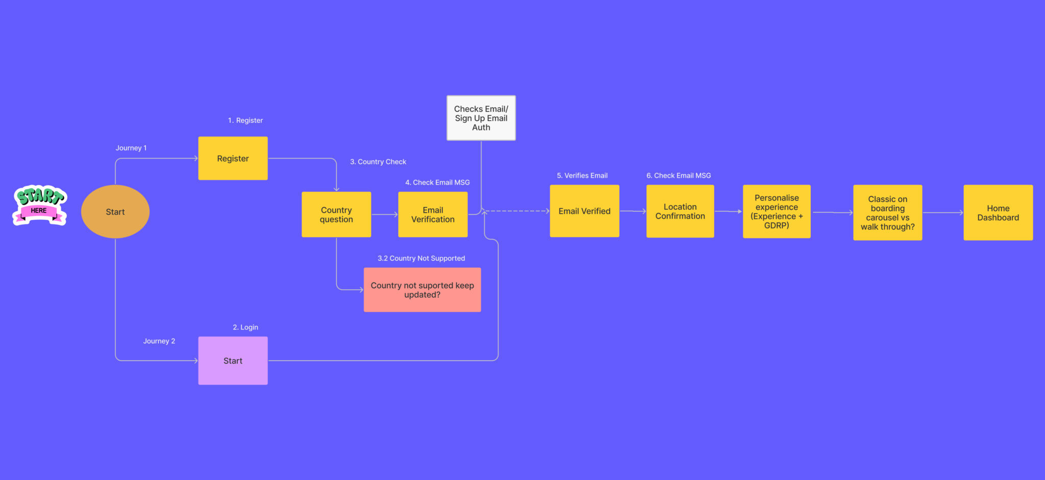
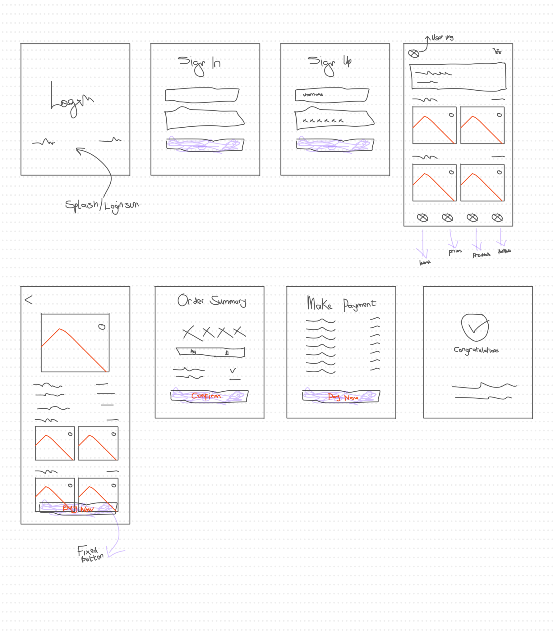
I mapped the information architecture and critical user flows before moving through sketches, early usability checks and wireframes. The onboarding journey connected account setup with the information needed to begin exploring metals.
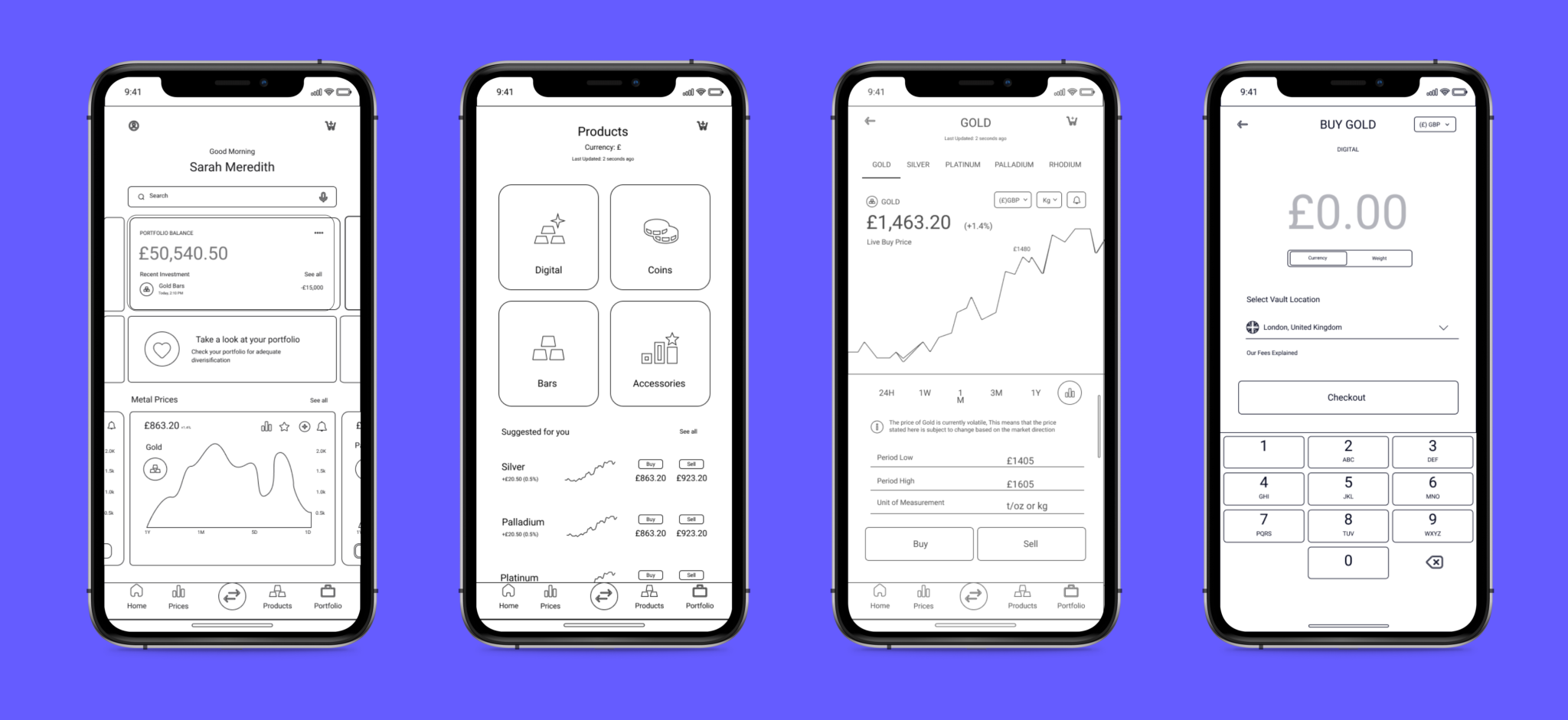
Making information actionable
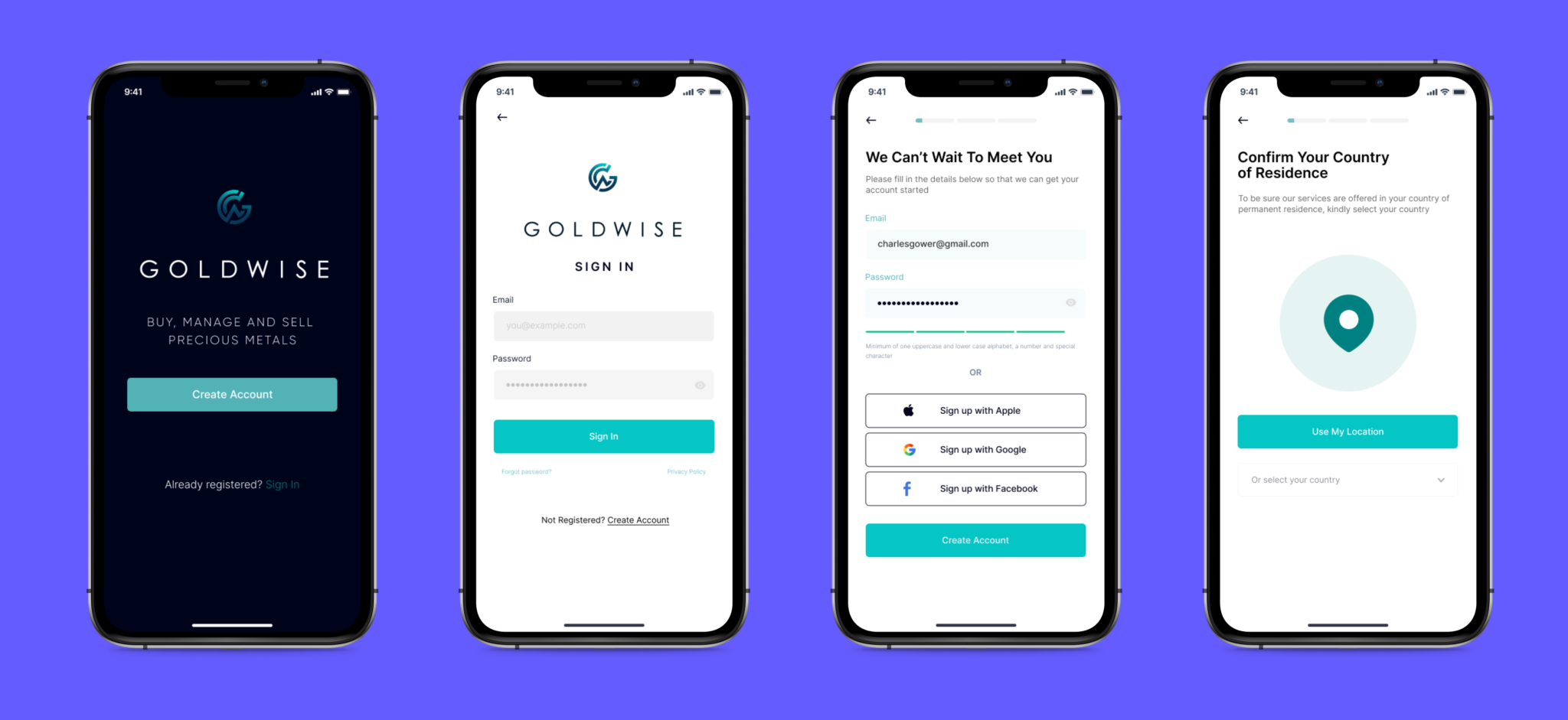
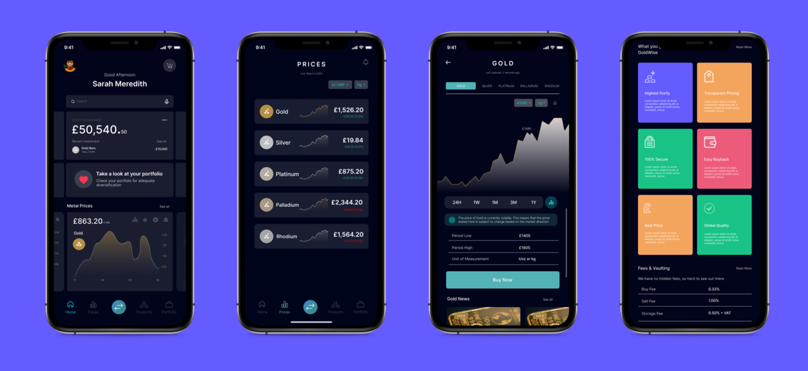
I developed the visual design around clarity and simplicity, using Inter, restrained borders, clear hierarchy and prominent actions. The interface brought metal prices, product information and trading activity into a consistent mobile system.
The supplied designs explore both light and dark screens, with teal actions and illustrations of the metals. I used a UI kit as a resource for the design, adapting it to the product rather than treating the kit as the finished experience.
Testing and refining the experience
I built a Figma prototype covering onboarding, buying and selling, then ran two remote testing rounds with five participants in each round. The first round exposed three issues: the prices page lacked a clear path forward, the product action was hard to identify, and the questionnaire needed more support for unfamiliar terminology.
I revised the page hierarchy, actions and supporting explanations. In the second round, participants navigated the homepage without the earlier hesitation. Product information was more helpful, but the results still needed clearer explanations of why different options were suggested. The testing supported further iteration rather than a claim of a finished solution.
What I took forward
The four-month project reinforced the value of narrowing the problem and returning to research when the scope became broad. Bringing together trading, ecommerce and financial account journeys made early specialist input particularly valuable.
The next design priority would be to explain the differences between suggested investment options and extend helpful explanations across the questionnaire. These are design opportunities identified through testing; the project does not establish live trading performance or commercial results.