SleepMate · Dawn Health · Mobile app design
Designing a clearer way to record and review sleep
A purple-led mobile interface that brings sleep logging, daily summaries and bedtime tools into one experience.
- My role
- UI Designer
- Client
- Dawn Health
- Scope
- Flows, wireframes, UI & prototyping · 2022
01Project overview
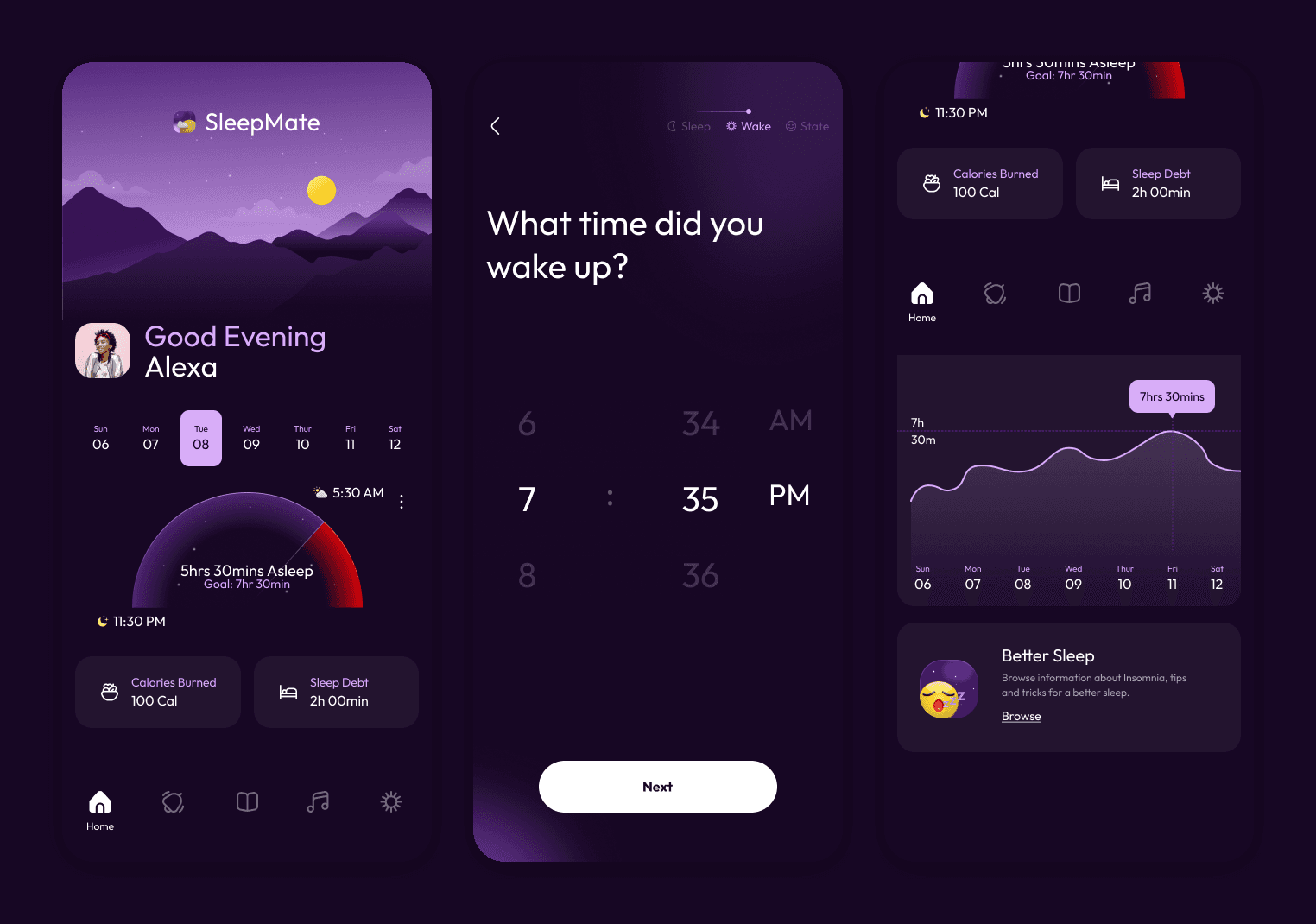
SleepMate is a mobile application I designed for Dawn Health, for people experiencing insomnia who want to record their sleeping habits and access tools for their bedtime routines. The app brings a sleep diary, daily summaries, educational content and relaxing audio into one interface.
I worked independently as the UI Designer. My contribution covered user flows, wireframes, visual identity, screen layouts, interaction design and a connected Figma prototype. I translated the product concept into a consistent interface, with particular attention to the dashboard and the three-step logging journey.
02The design challenge
The interface needed to support two different moments: recording a night’s sleep and returning later to review it. It also needed to give people direct access to audio and educational content without requiring them to complete a sleep entry first.
My design question was: how could I make the next action clear while keeping sleep information easy to scan? I focused on a visible entry point, one question per logging screen and a consistent hierarchy across the application. These were design intentions and working scenarios, rather than findings from user interviews.
03Connecting the experience
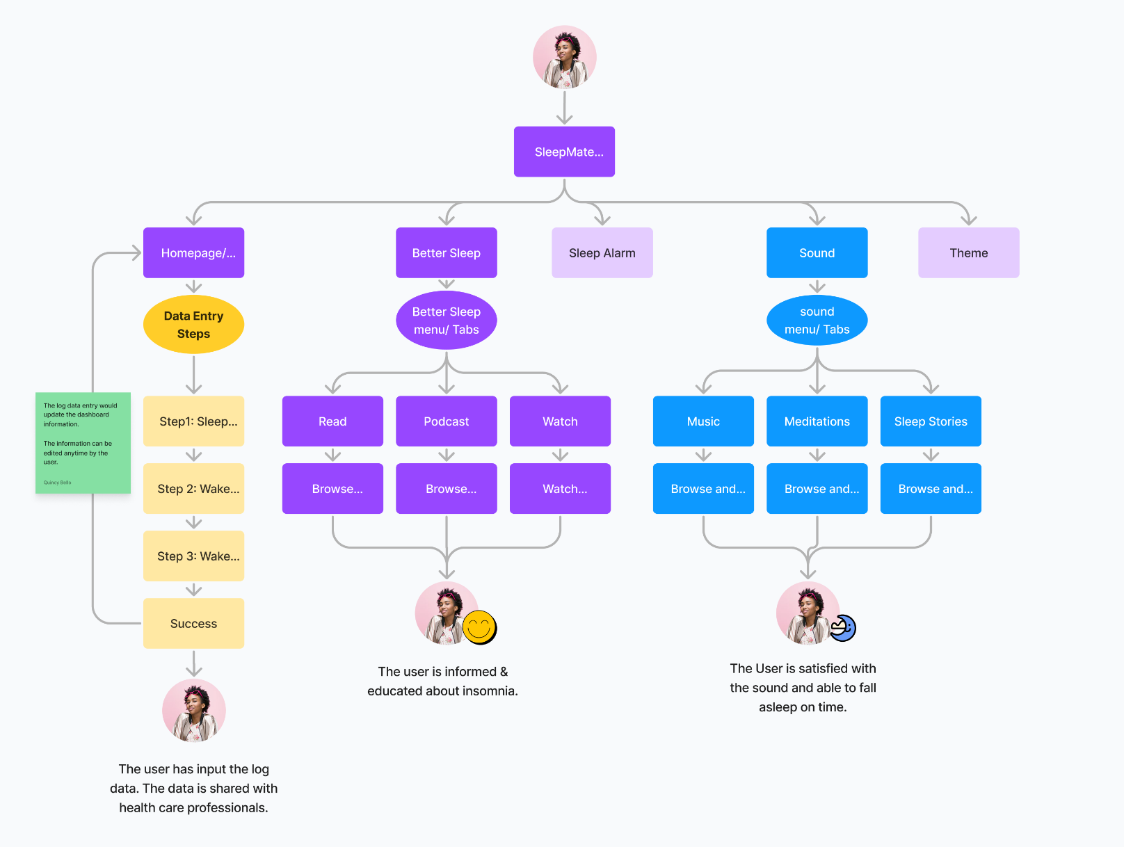
I mapped the screen connections around five areas: Dashboard, Better Sleep, Sleep Alarm, Sound and Theme. The dashboard is the entry point for a new sleep record, while the supporting features have their own routes.
The core loop moves from the dashboard through sleep time, waking time and waking state, then returns to the dashboard after submission. The flow helped define how the individual screens would connect before I refined their layouts.
04Structure before styling
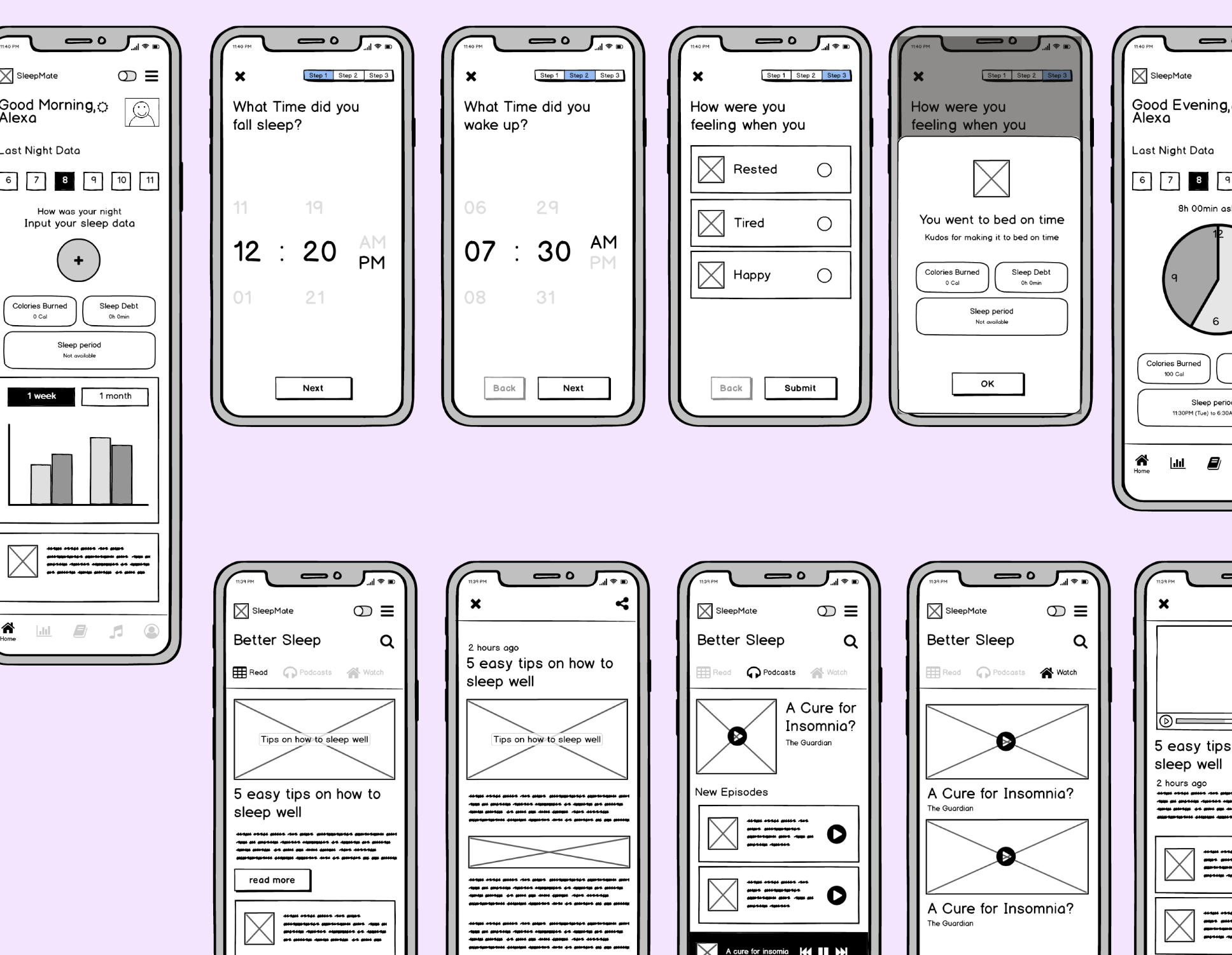
The low-fidelity wireframes explored content hierarchy, space allocation and the position of key actions. On the dashboard, I brought together a greeting, date selection, a sleep summary and the action to add a record.
For logging, I established a repeated screen structure with a single question, an input, a step indicator and a primary action. The Better Sleep wireframes explored reading, podcast and video layouts within the same navigation system. This gave the visual design a consistent structural foundation.
The wireframes also show where the design changed. The waking-state options began as Rested, Tired and Happy and became Rested, Tired and Sick in the final screens, and the early dashboard's bar chart with a week and month toggle became a weekly sleep trend chart below the night's summary.
05A purple-led visual system
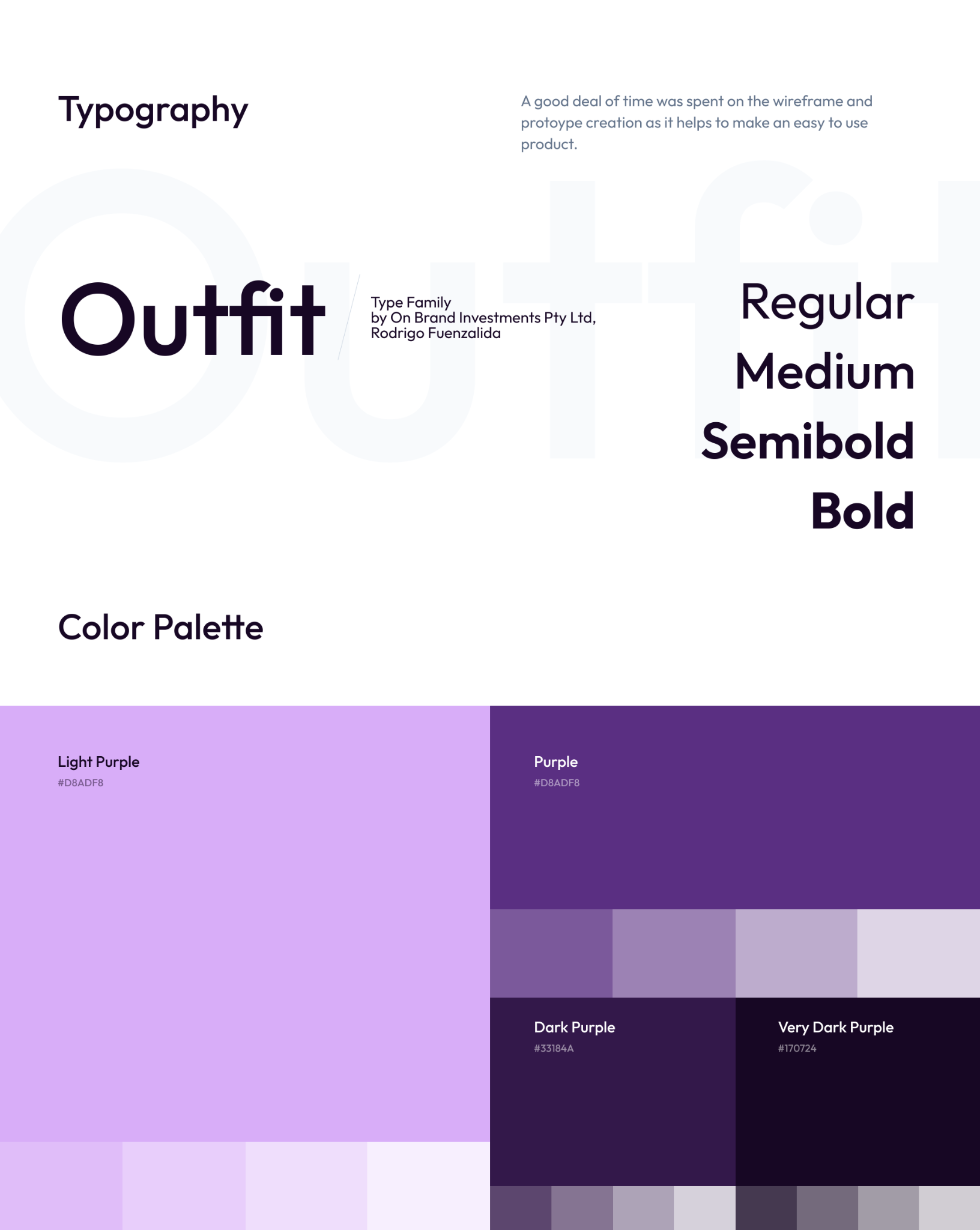
I used deep purple backgrounds, lighter purple accents, rounded controls and night-time illustrations to give SleepMate a recognisable identity. The illustrations establish the sleep theme, while contrast and scale separate the main controls from supporting information.
Outfit is the original application typeface, using Regular, Medium, Semibold and Bold weights for labels, body text and headings. The palette runs from light purple (#D8ADF8) through purple (#5A2F82) to dark purple (#33184A) and very dark purple (#170724), each with lighter tints. I also explored a light theme as an alternative appearance.
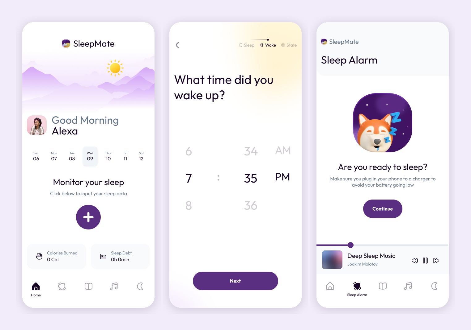
06A dashboard with a next step
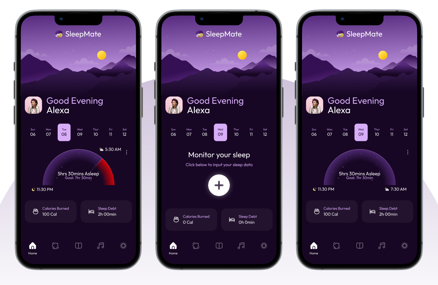
The dashboard has two distinct states. Before a record is available, a prompt and prominent plus button invite the user to log their sleep. With a record present, that space becomes a semicircular summary showing sleep duration, bedtime and waking time.
A horizontal date selector keeps previous days close at hand. The greeting and illustrated landscape give the screen its character, while the central summary receives the strongest emphasis. Supporting metrics sit below it so they do not compete with the main record. Further down, a weekly chart shows how sleep duration changes across the week.
The original screens include sleep debt and calories burned. These remain concept metrics: their definitions, calculations and usefulness would need to be established before release. The values shown in the artwork are illustrative interface data.
07Three questions, one focused flow
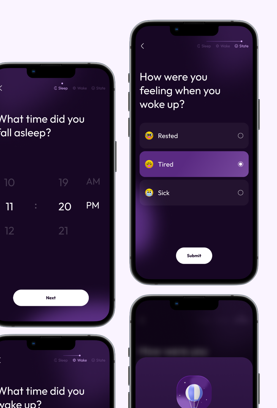
I split sleep logging into three steps so that each screen asks for one piece of information. The time selectors separate hours, minutes and AM/PM, while the progress indicator keeps Sleep, Wake and State visible throughout the journey.
The final screen offers labelled options for how the user felt on waking. A highlighted selection and radio control make the chosen state visible. Next, back and submit actions support movement through the sequence, with a confirmation state after submission.
This was a proposed interaction pattern, not a measured improvement in completion time. A future iteration would test time selection, overnight entries, correcting mistakes and returning to an unfinished record.
- 01 / Sleep
When did you fall asleep?
Record the time with an hour, minute and AM/PM selector.
- 02 / Wake
When did you wake up?
Use the same input pattern for the morning’s waking time.
- 03 / State
How did you feel?
Select Rested, Tired or Sick, then submit the record.
08Supporting the wider routine
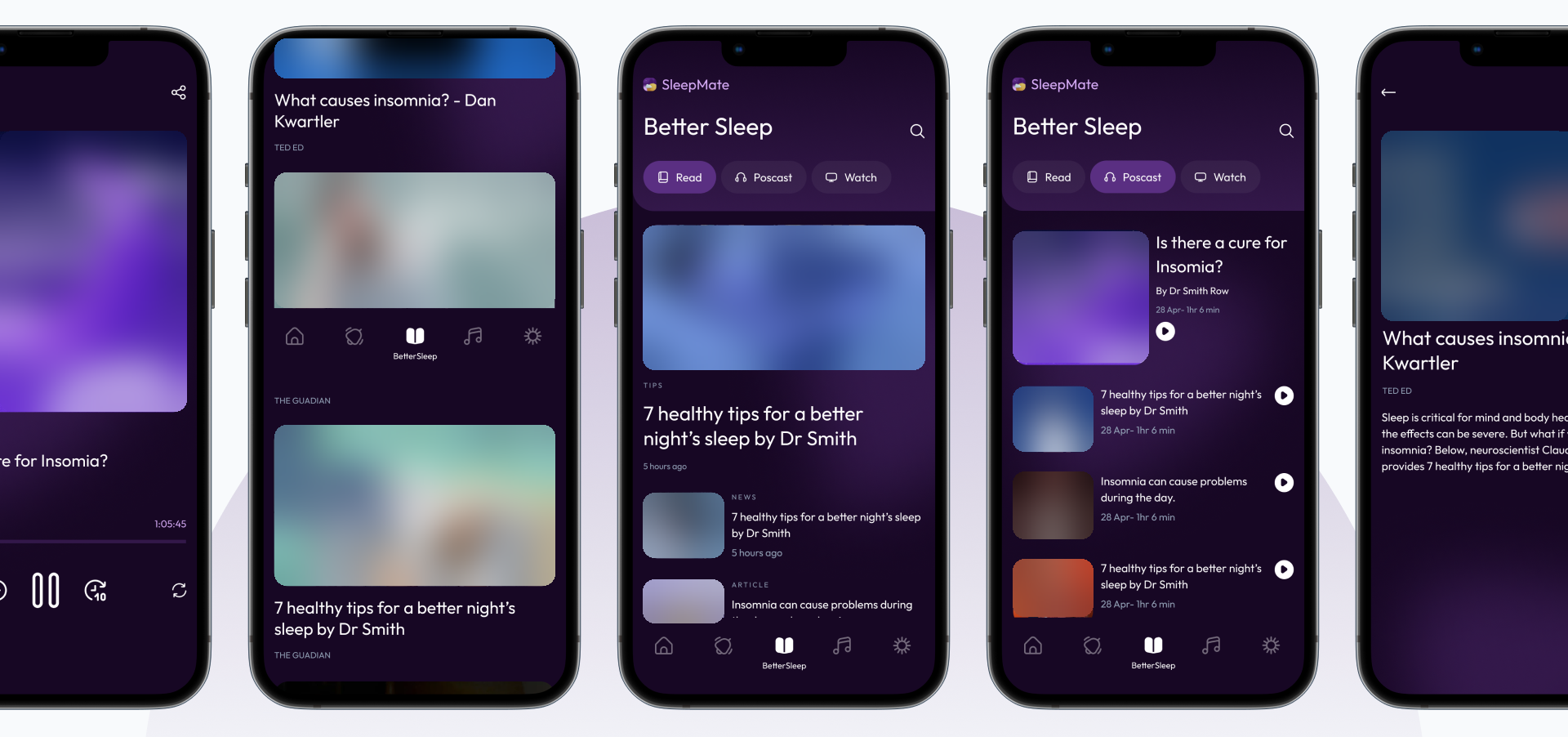
Better Sleep organises educational content into reading, podcasts and video. Cards and format-based navigation let the interface accommodate different types of content without changing the underlying browsing pattern.
Sound brings together music, meditation and sleep stories, with playback screens for the selected audio. Sleep Alarm explores setting a sleep period with background music. The alternative light theme extends the visual system to a different appearance preference.
The wider concept also proposed communication with healthcare professionals. Any live version would need a defined service, appropriate handling of personal information and reviewed content. These features are presented as interface concepts, not delivered clinical services.
09Reflection and next steps
The strongest thread through this project is the relationship between structure and visual identity: the flow defines the task, the wireframes organise each screen, and the finished interface uses hierarchy and repeated components to make the sequence coherent.
Revisiting the 2022 design, I would prioritise clearer explanations of metrics, accessibility checks for contrast and text size, and more complete error, editing and empty states. I would also evaluate the logging flow with intended users before making claims about ease of use.
The outcome of my work was a set of flows, wireframes, high-fidelity interfaces and a Figma prototype.