Sparkle · Website design · 2020
Introducing a new digital bank to Nigeria
The launch website for Sparkle, a digital and lifestyle bank for personal and business customers, designed from a blank page.
- My role
- UI/UX Designer
- Client
- Sparkle
- Scope
- Research, structure, UI & prototyping · 2020
01Project overview
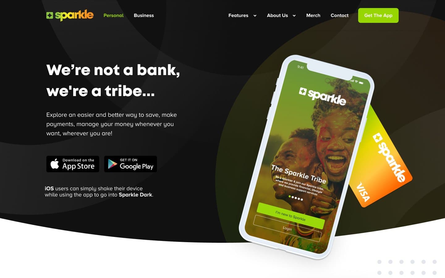
Sparkle launched in 2020 as a new digital and lifestyle bank in Nigeria, built around a mobile app for personal and business customers. It needed a website that could introduce the brand from nothing: what Sparkle is, what it offers and why someone should download the app.
I was the UI/UX Designer on the website. My work covered research and competitor reviews, the site structure and navigation, the page designs for the personal and business home pages, every product page and the company pages, and a connected Figma prototype.
02The design challenge
There was no old site to redesign. Sparkle was new, so the website carried the whole first impression: it had to explain a bank that describes itself as a tribe rather than a bank, and earn enough trust for someone to hand over their money.
It also had to speak to two audiences at once, people managing their own money and owners running a business, and present a product range that was already wide at launch and set to grow. Every route through the site needed to end in the same place: getting the app.
03Research and competitor reviews
I started with research into Sparkle's audiences and reviewed the websites of other banks and fintechs, looking at how they explained their products, organised large product ranges and signalled that they could be trusted.
That work shaped the decisions that follow: a clear split between personal and business banking, a structure that could hold many products without burying them, and pages that lead with what a feature does for the customer rather than with banking jargon.
04Structure for a growing product range
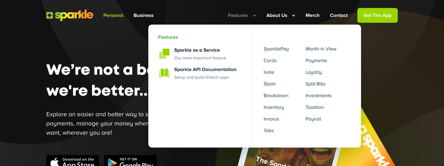
The top navigation leads with the two front doors, Personal and Business, and keeps a Get The App button on every page. Features opens a menu that lists the products in columns, from SparklePay and Cards to Invoice, Tabs and Loyalty, with Sparkle as a Service and the API documentation set apart for partners. About Us groups the company pages.
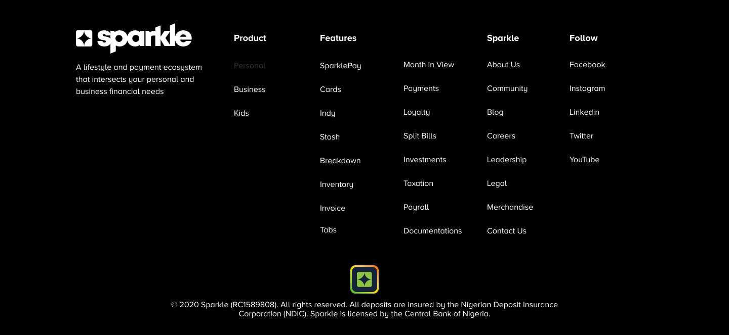
The footer repeats the whole site map in four columns, Product, Features, Sparkle and Follow, so any page is one click away from the bottom of every page.
05Two front doors: Personal and Business
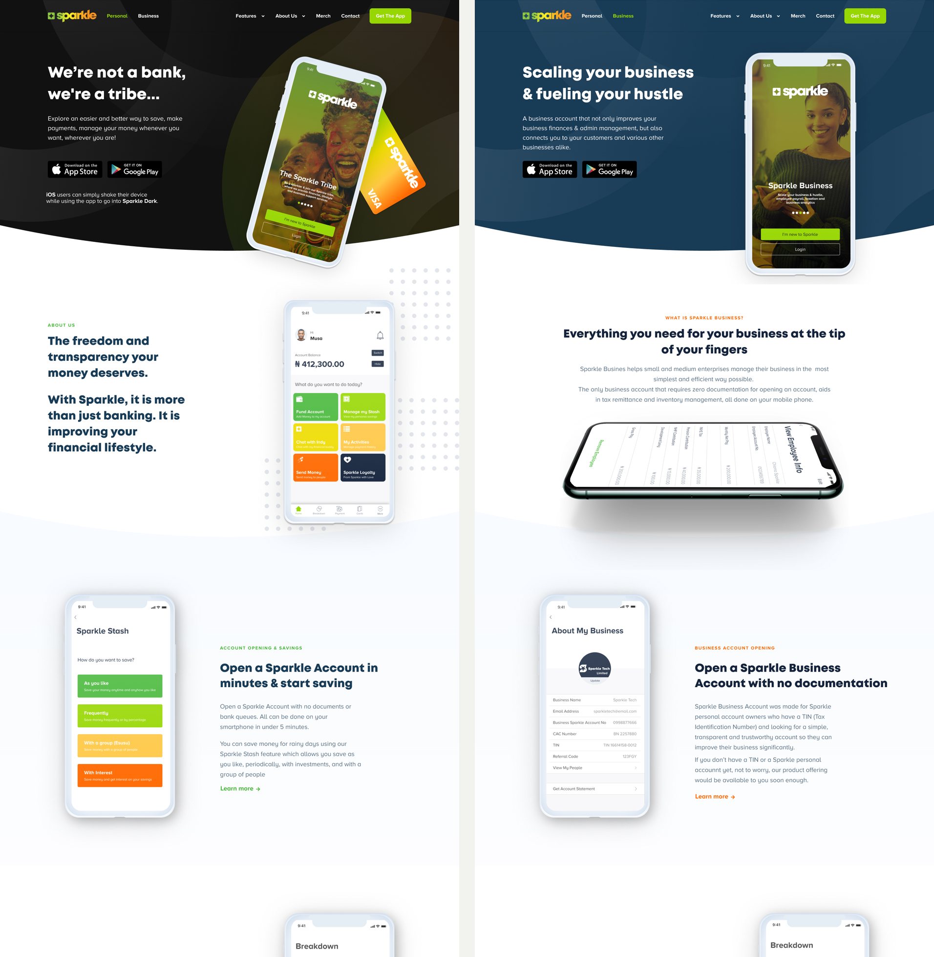
Each audience gets its own home page. The personal home opens with the brand line, We're not a bank, we're a tribe; the business home opens with scaling your business and fuelling your hustle. Both carry the same app store buttons straight away.
Below the hero, each home page walks through the key features one at a time, pairing an app screen with a short, benefit-led heading and a link to the full product page.
06One template for every product
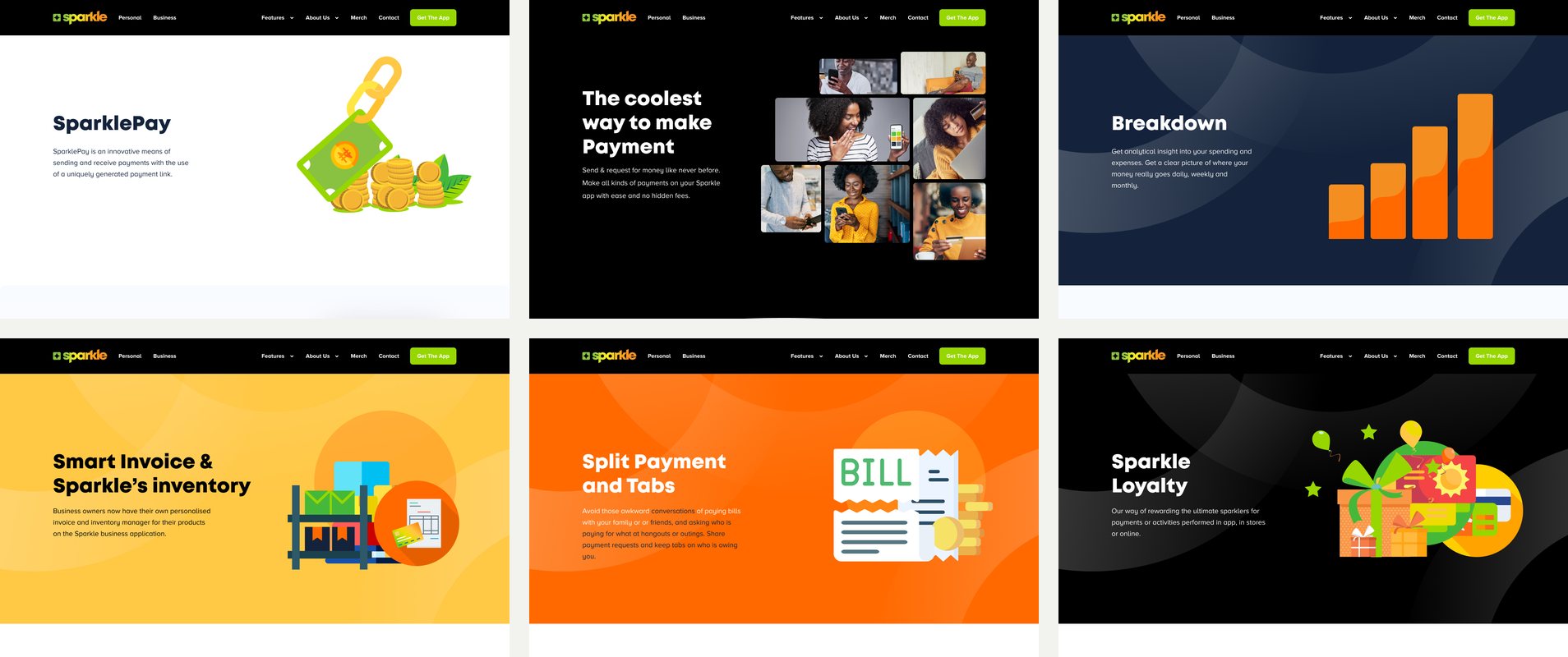
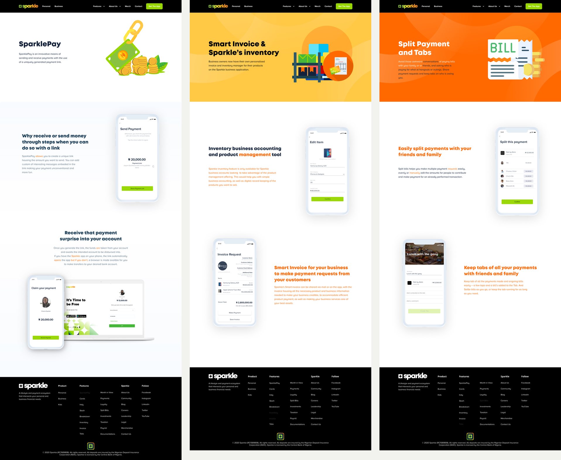
Every product page follows the same template: a hero with the product name, a one-line promise and its own illustration, then alternating sections that pair real app screens with what each feature does for the customer.
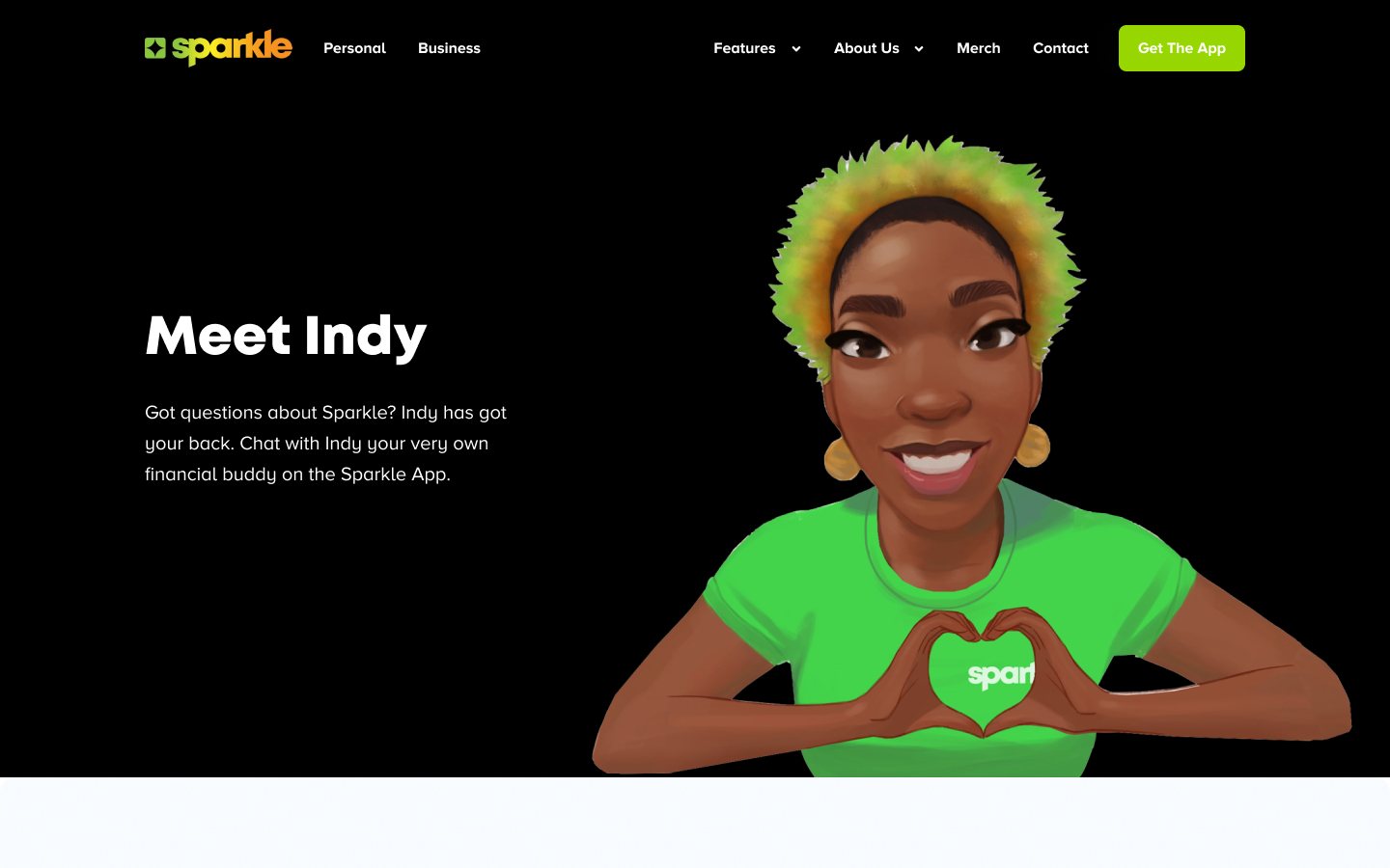
Because the structure stays the same, each product keeps its own colour and personality while the site stays consistent, and new products could be added without designing a new layout. The set covers SparklePay, Payments, Breakdown, Invoice and inventory, Tabs, Loyalty, Stash, Cards and Indy, Sparkle's conversational finance assistant.
07Earning trust beyond the product
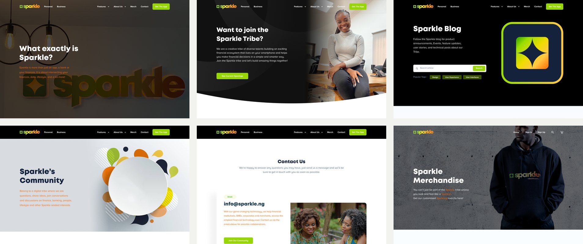
A new bank has to show who is behind it. The company pages do that work: About Us explains what Sparkle is, with Leadership, Careers and the Blog alongside it.
Community, Contact and the Merch store extend the idea of a tribe beyond the app, with events, a direct line to support and branded merchandise.
08Designing the in-between states
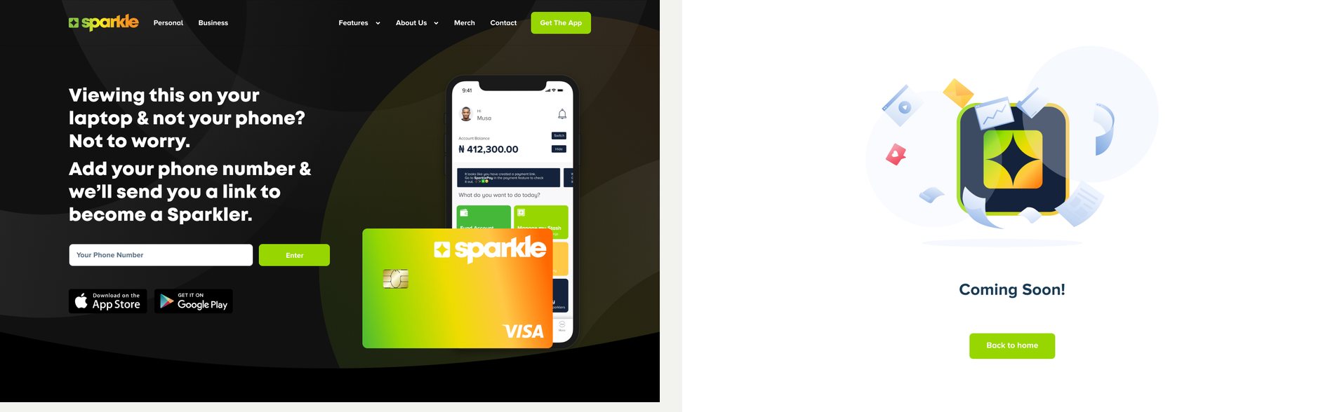
The designs include the states a launch site needs: a Get The App page for visitors on a laptop, who can enter a phone number to receive a download link, and a Coming Soon page for features announced before they were live, alongside a 404 page.
The pages are connected as a Figma prototype, so the navigation, menus and footer can be clicked through as a site.
09Reflection and next steps
Designing for a brand that did not yet exist meant the website had to set the tone for everything that followed, from the product pages to the community it hoped to build.
If I revisited the work, I would test the Features menu with customers to see how people find a product among so many, and look again at the mobile layouts, since a bank built around an app is likely to draw many of its visitors on their phones.